Shop Advizor
After launching the platform but not getting the growth they’d expected, the ShopAdvizor team got in touch with us for a full mobile & web app redesign.
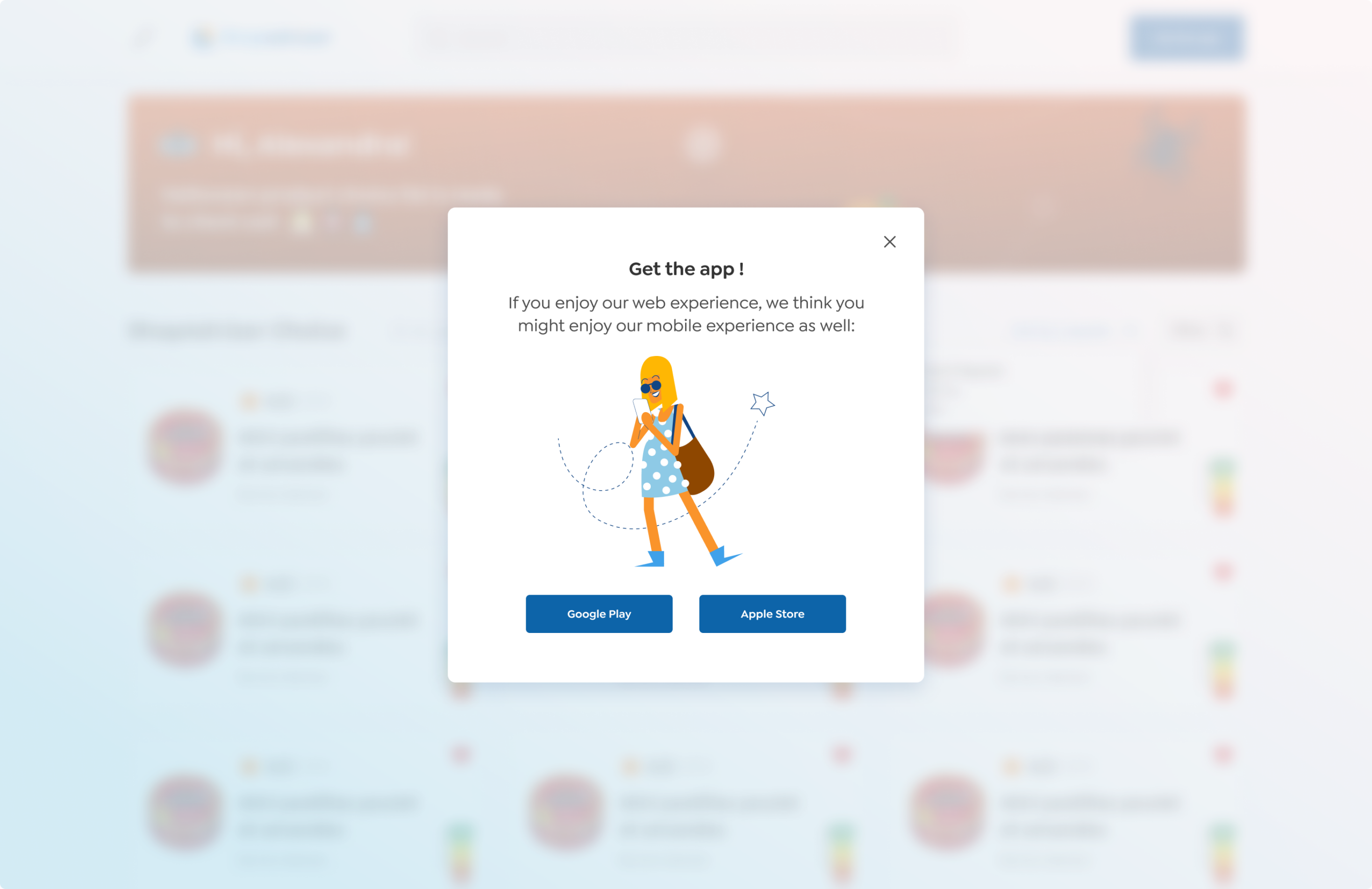
The prior design was too heavy, so we completely changed it. Added cute illustrations, re-thought the UX and made the platform look more stylish, attractive and brisk.
Mobile-first At its very first
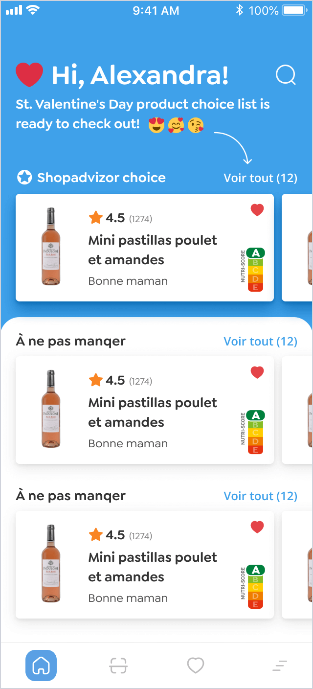
To harmonize the devices, we’d started with the mobile app and then synchronized its features on the web. ShopAdvisor is fully responsive, adapted for any screen (even your rusty iPhone 5).
We also designed a universal UX for the mobile and web apps. They may not be the same in looks but follow the same logic.
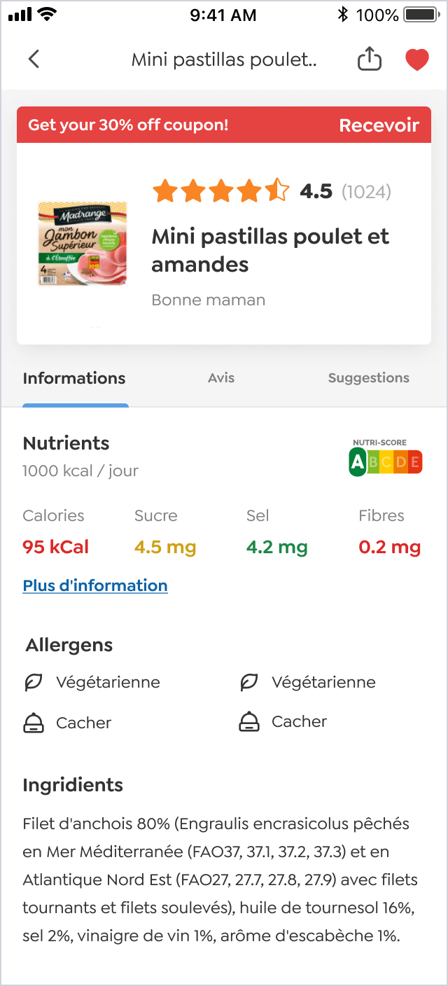
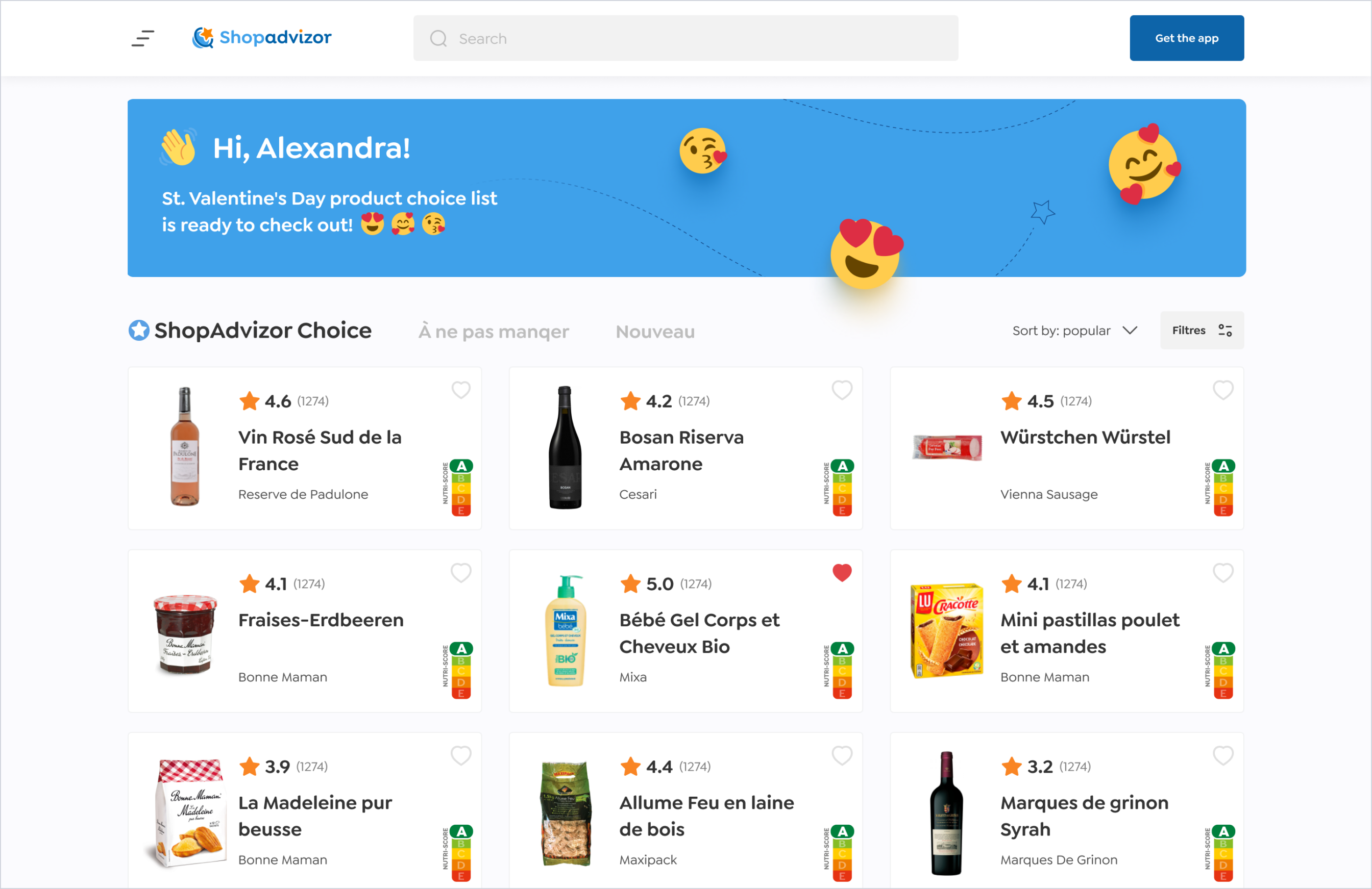
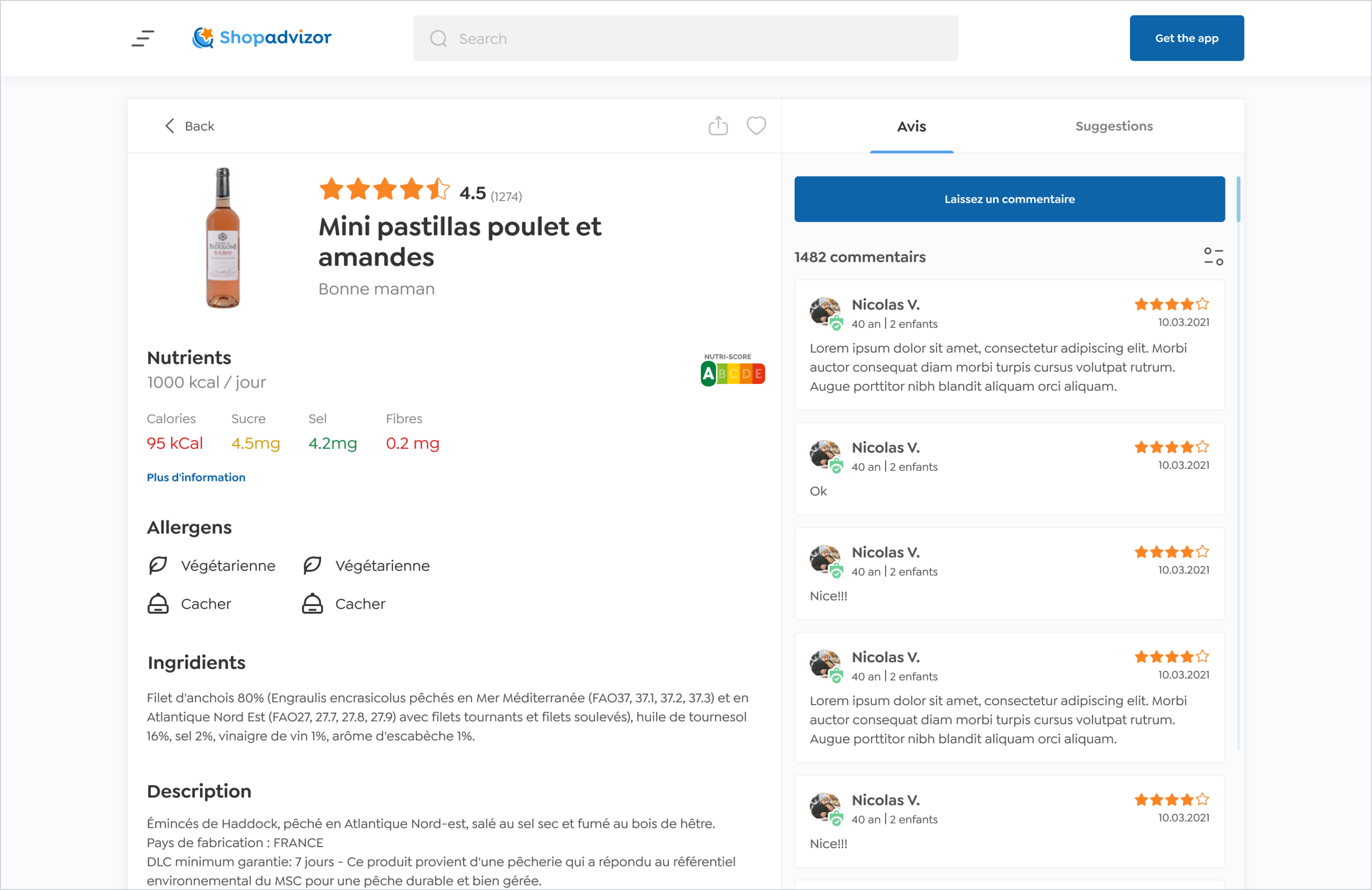
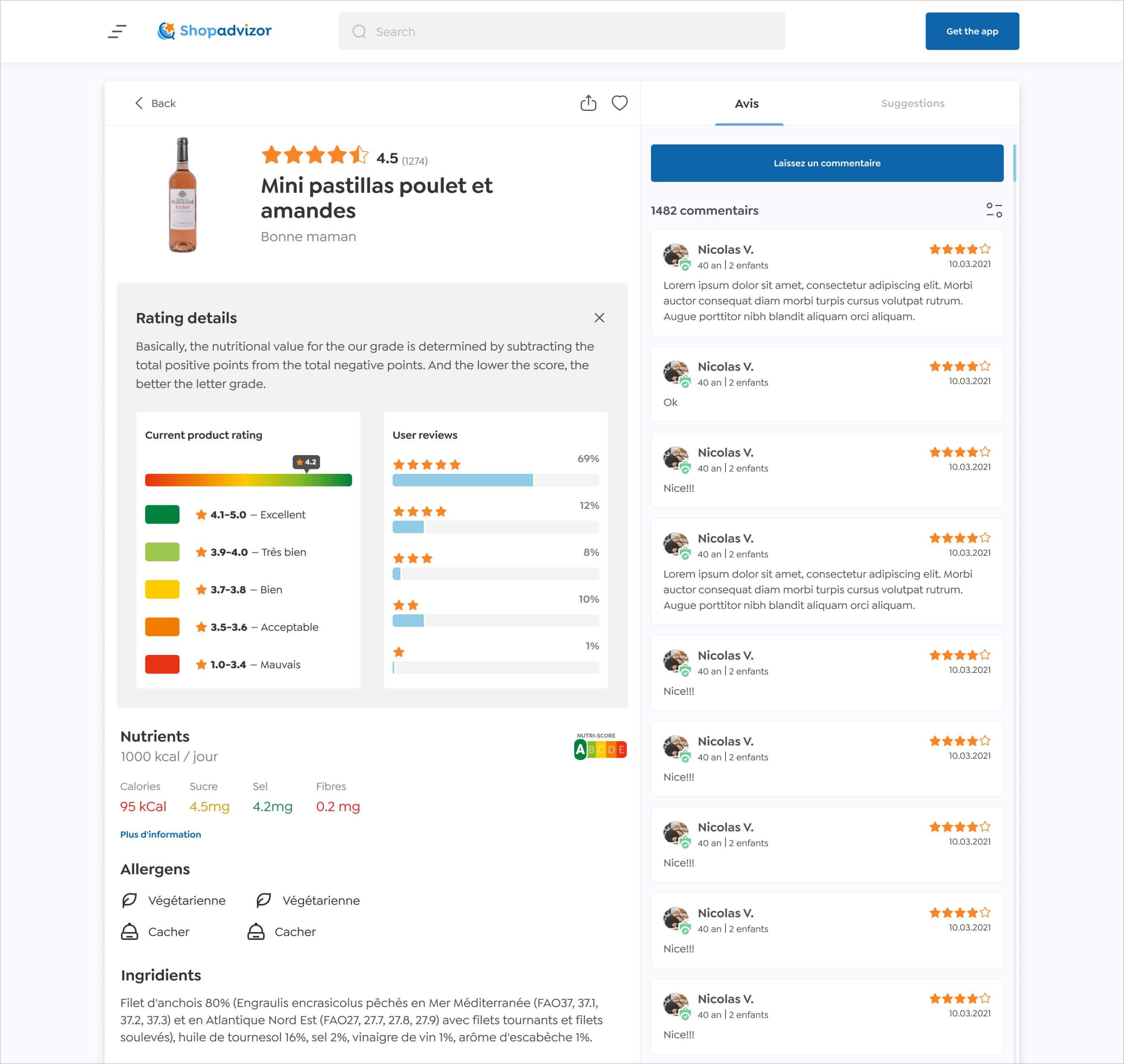
The toughest part was to come up with the product page design. It’s the one with an awful lot of details, and we had to arrange them the way each tiny bit of info remains seen. So that our picky users won’t miss a calorie.
Recommendations: our biggest
proud, users’ best advisor
ShopAdvizor isn’t for selling products: you can’t buy a thing directly on the platform.
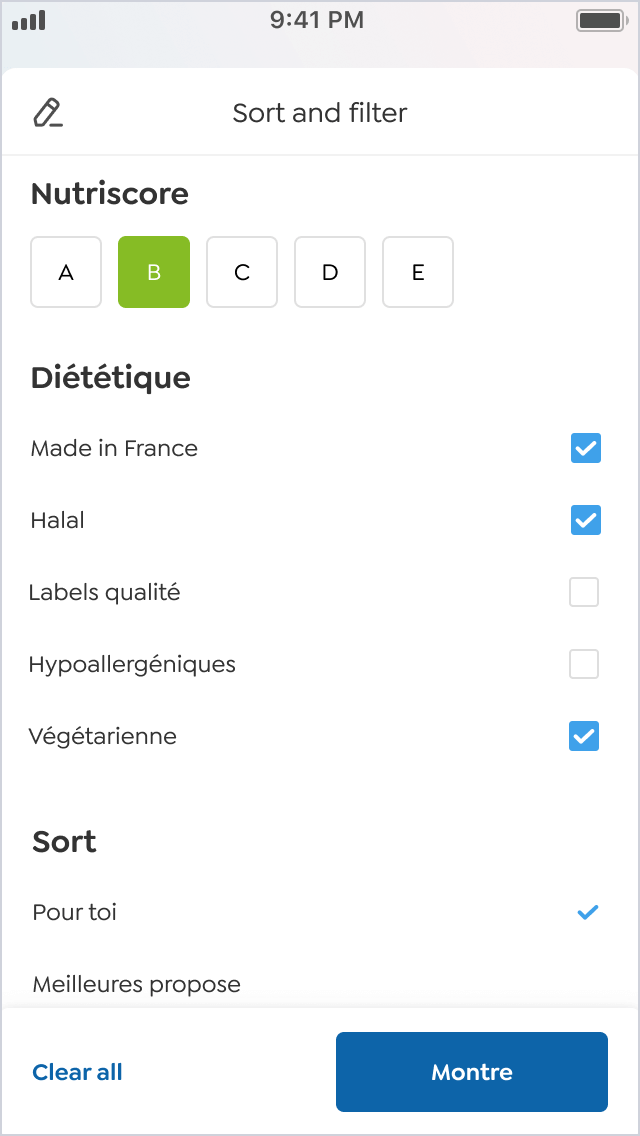
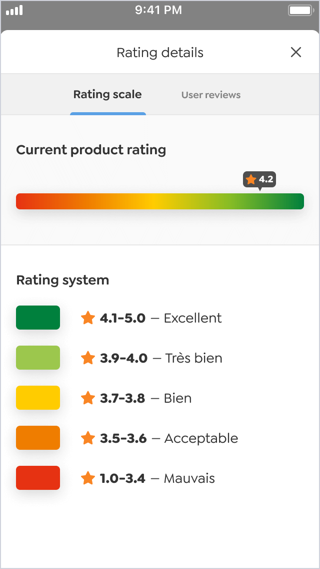
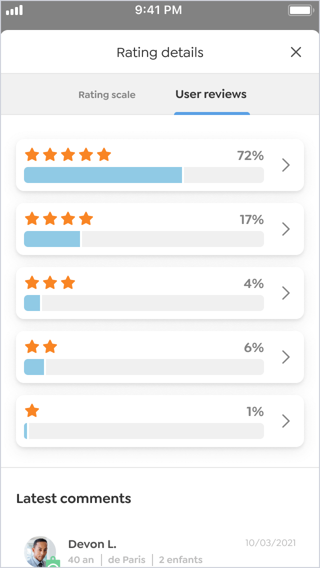
Instead, the service has a bunch of in-built features like the Nutriscore rating that shows the usefulness of each product. If you’re looking for the right oatmeal with blueberries, set the Nutriscore rating at ‘A’ — and you’ll see the most healthy & tasty options for your breakfast.
“Overall, Zgraya’s very knowledgeable in their field. They suggest things from a perspective that sets them apart from other providers I’ve worked with. The UI/UX design and the little development that I’ve seen shows that they know what they’re talking about.”
What’s under the hood
Unlike most of our projects, where we take care of both the interface and the server sides, with
ShopAdvisor it was just the frontend — the UI — part that we worked on.
What we did though wasn’t just laying out the elements. We wrote the frontend’s app logic. And mocked — replicated — the backend to show some close-to-real data interactions instead of dummy placeholders or Lorem Ipsum.
The goal
Make it easier for our client’s backend devs to link the client and server parts. They’d only have to replace our mocks with actual data requests, and that did the job.
Similar story with the use of styled components and a storybook (holds all the components—titles, buttons, drop-down menus, etc) for this project. The reason was to have all UI elements in one place, make it simple to explore already developed components, and help the backend guys figure out how the UI works without delving deep into the client-side code.
Project team
Art Direction — Vladimir Klynnyy
Design — Nicolas Vakhliuev, Helga Altuhova
Managment — Matvii Kurochka
CTO — Anton Fedulov
Development — Dmitry Kadchenko, Yevhenii Ivchenko