Lumis
The style
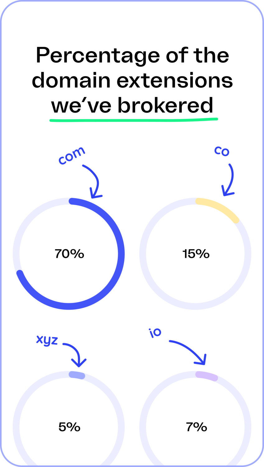
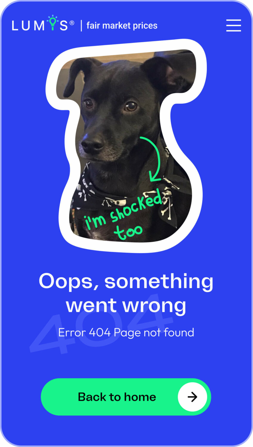
Since the client wanted to have more friendly and warm atmosphere for the website, we used simple elements, a bright color palette, and soft shapes to convey. And small silly illustrations—lots of them.
Font
To boost the friendly effect, we chose contrasting and catchy Freizeit typeface together with simple and geometric Outfit. Well, opposites attract.
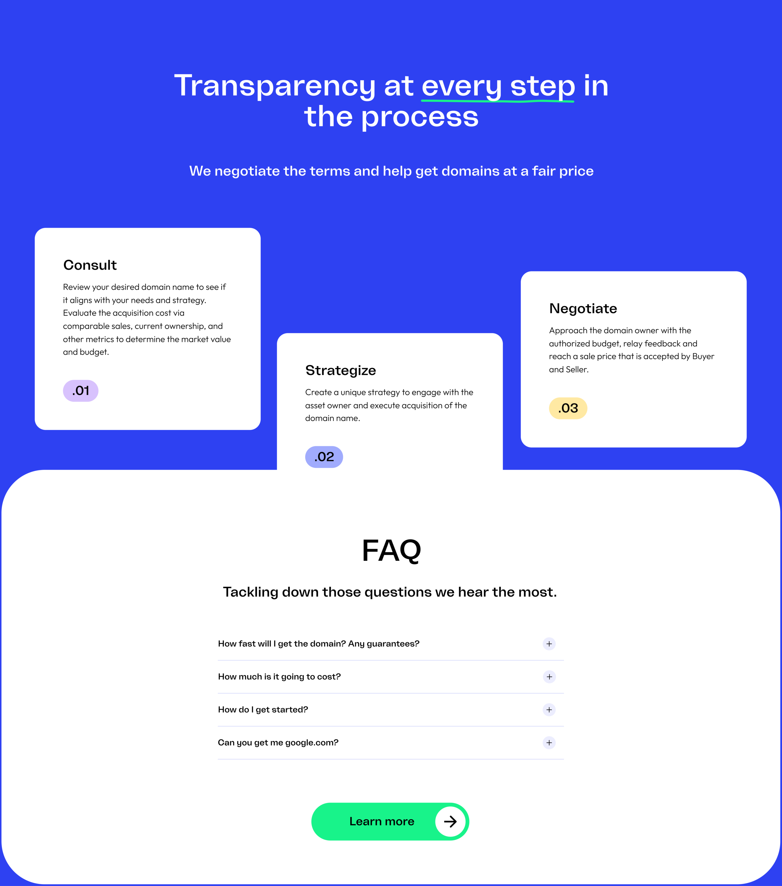
We decided that for Lumis it would be better to have not just only new desine of website, but also tuned their old logo a bit, making it more stylish and recognizable. And added some bright colors to their already existing color palette.
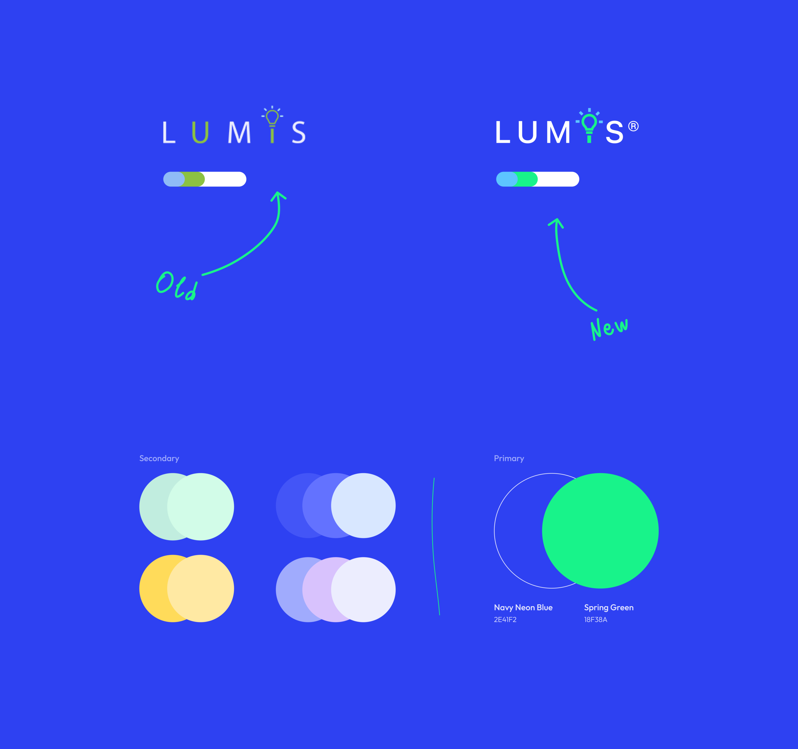
Mobile comes second
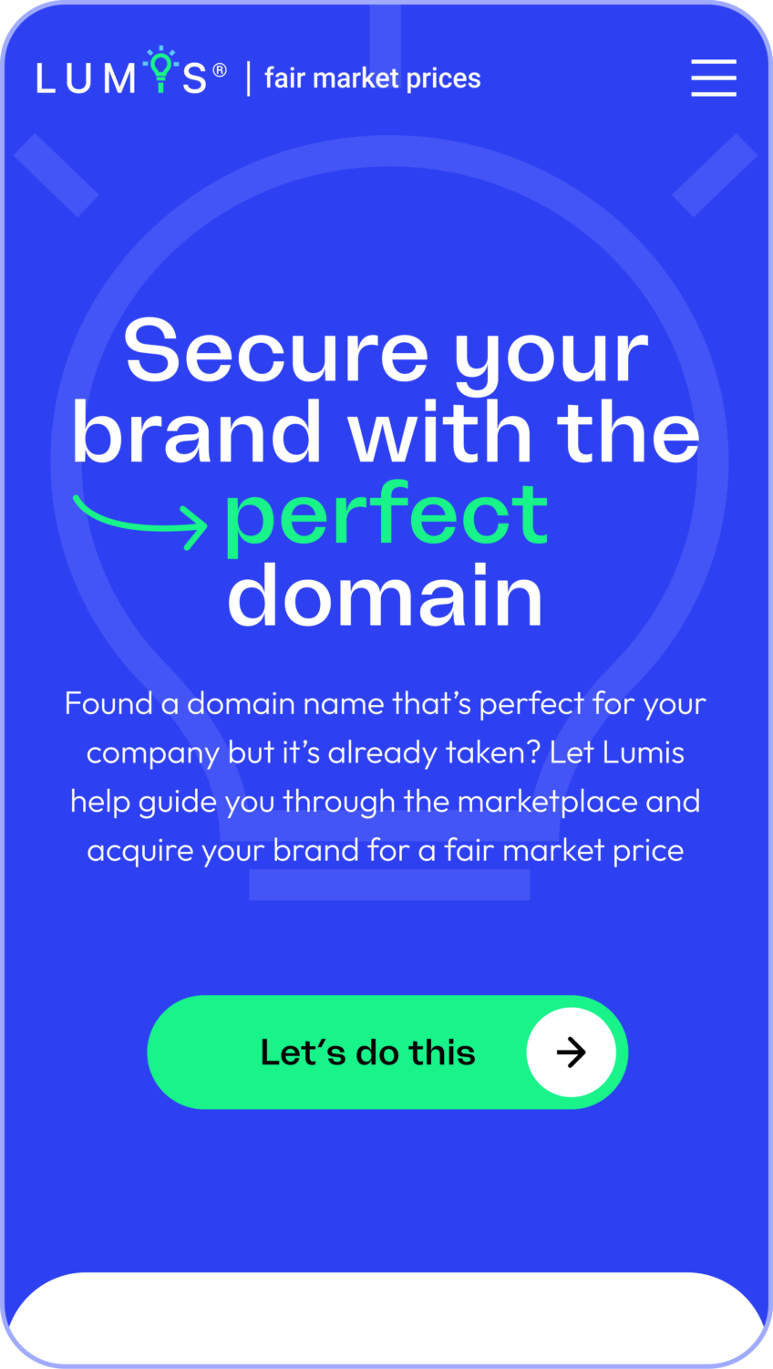
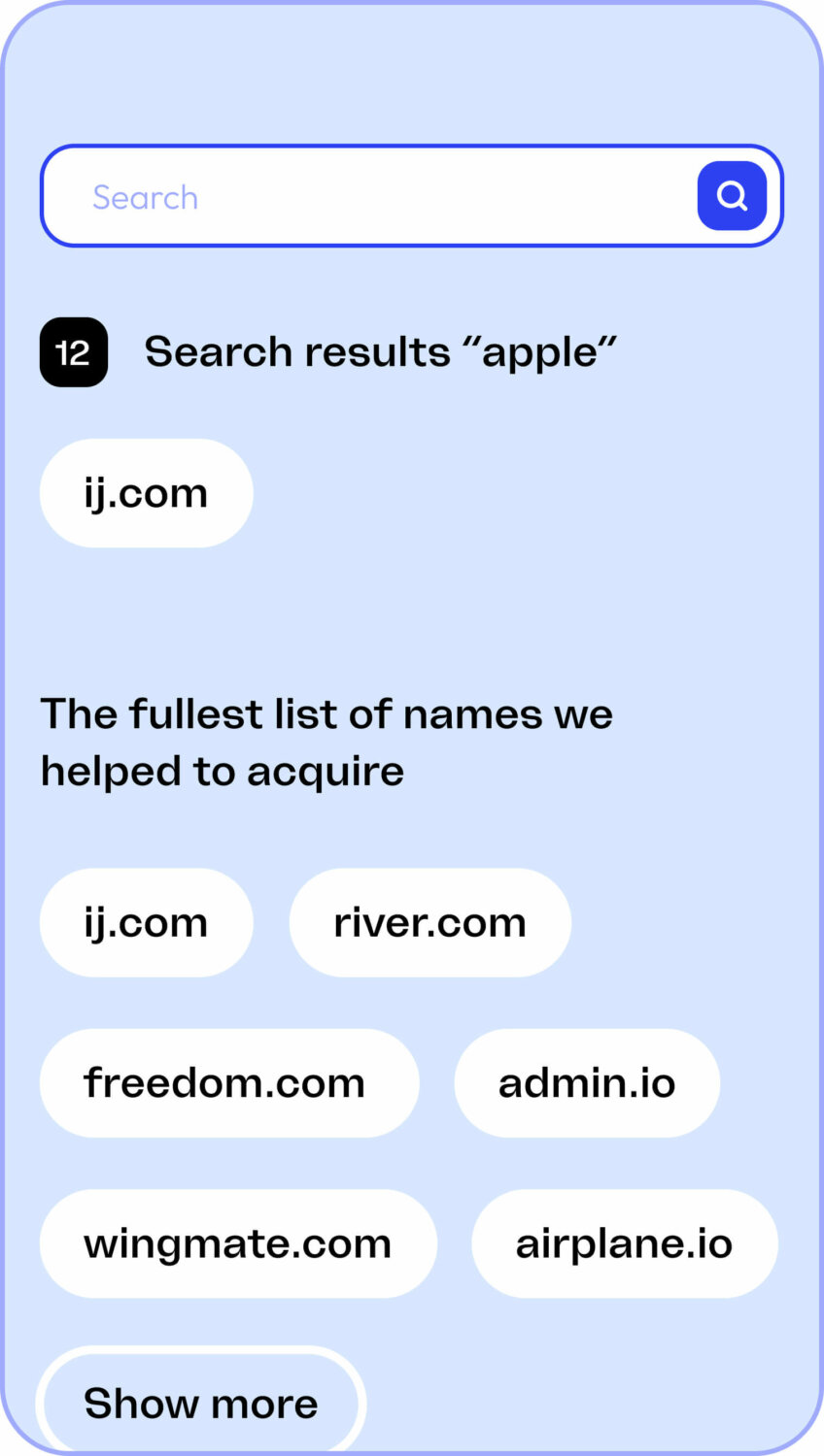
We also adapted the website for mobile devices, smartphones and tablets to ensure that Lumis clients have the best digital experience on different platforms. Surely it’s more convenient to choose the domain name of your dream with a smartphone. Same for reading all these transfer guides, ugh.
Team Section
We moved away from the suits-and-ties concept of presenting the team long ago. And it’s always nice to see other companies who did the same.
To properly introduce the Lumis team, we added some nice photos and then some animations and hand-drawn illustrations on top of these photos, working on hover. Let’s give credit to the team: their works were amazingly creative.
Zgraya was able to help achieve our goal in a spectacular fashion. The end product is exactly what we were hoping to accomplish. Which was, a website that matches the quality and service offering that our company provides to our clients.
Project team
Art Direction — Valentyna Sulima
Design — Julia Hanzhenko
Management — Masha Push
Development — Ihor Kovtun
Copywriting — Maria Diachenko