Detector Media
Project website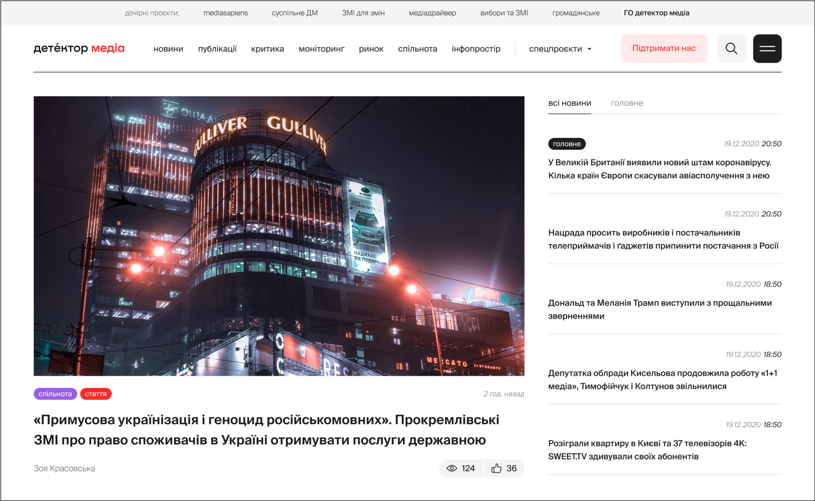
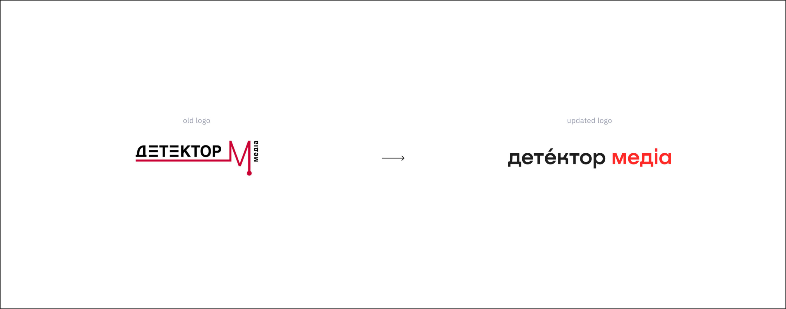
REFRESHING THE LOGO
Detector Media wanted to give its identity a new life, which included logos for the overall umbrella brand and all the subprojects.
The old logo had a nice, particular character but was crowded with detail: stylized Es, the pulsating M, the dot at the end of the pulse, the word “media” written vertically, which wasn’t very legible.
We refreshed and simplified the logo, leaving only the essential accents, adding a modern font, made the word “media” red. We added an accent on “detektor” that not only signifies the stress on the syllable, it’s also a metaphor for the Detector itself, which finds and passes on the most important information to its readers.
We then had to come up with a way to unify all the subprojects and sections on the website, such as video archive, separate news sections, social initiatives etc. All of these had different identities in different styles and used different colours.
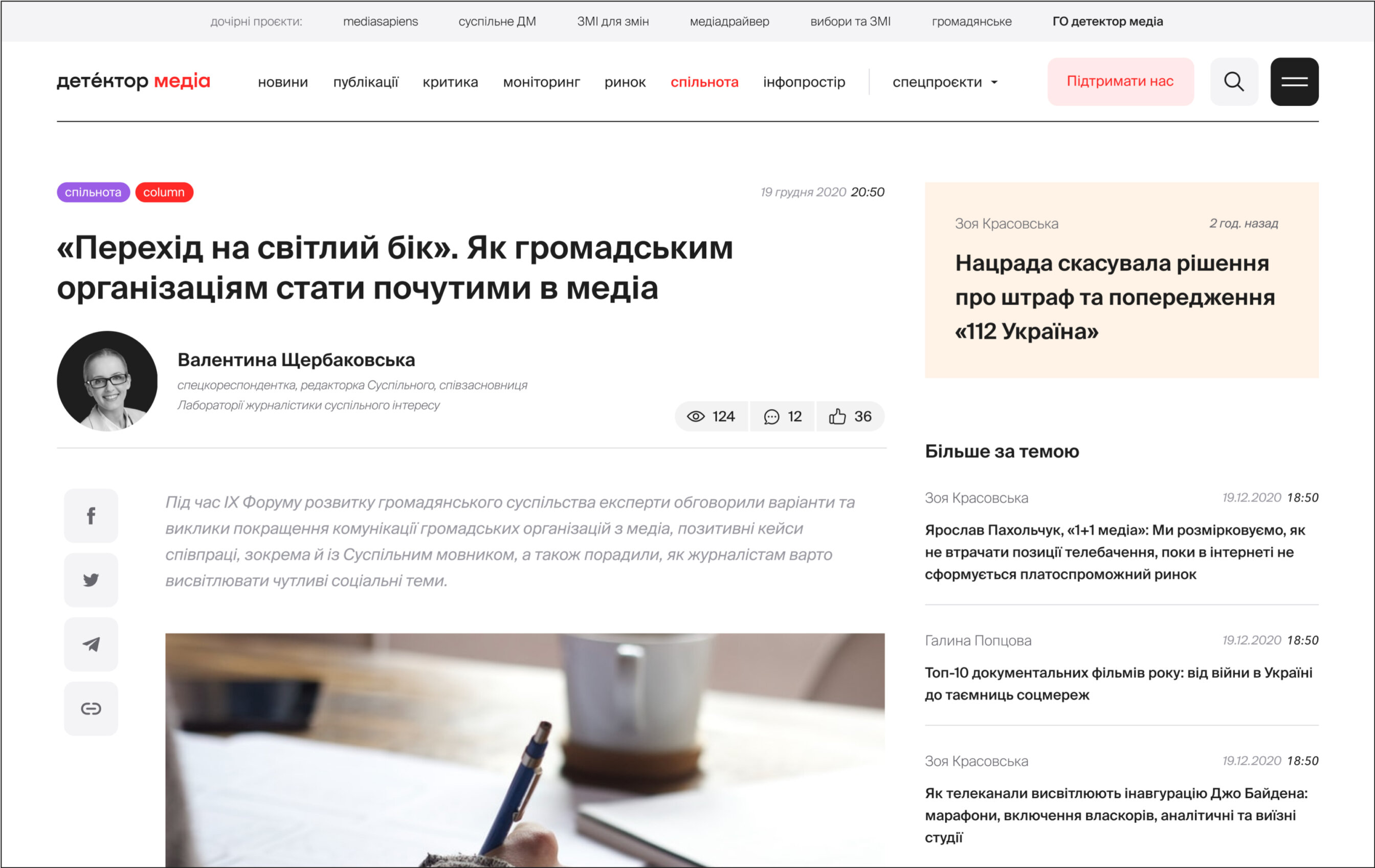
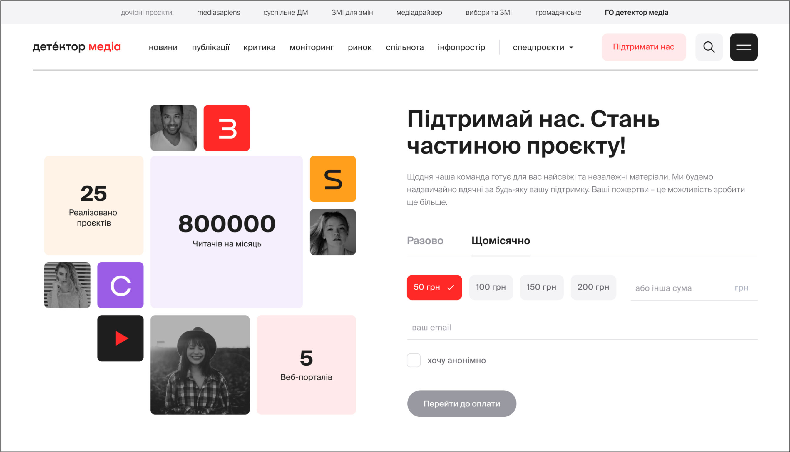
We kept the additional colours to have continuity with the current website, but added a set of icons all in the same style to let users quickly identify each project and where they are on the website.

detector Media publications
The website offers a massive news feed in different categories, with media reviews, media content monitoring, media market reviews and analytics, state information policy, media industry issues, masterclasses and interviews with media professionals, etc.
All of that had to coexist in the best possible way on the new, simple, logical website.
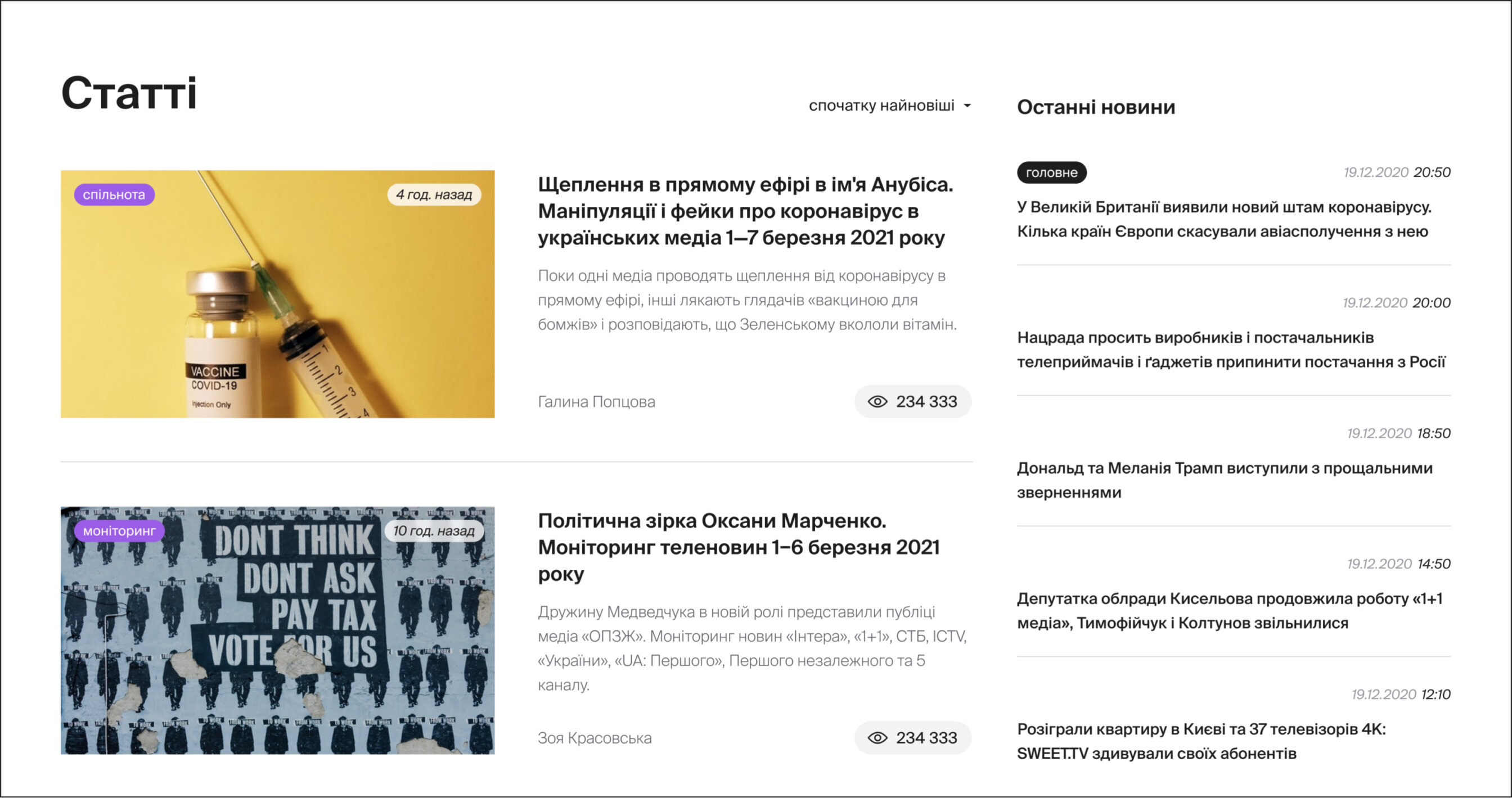
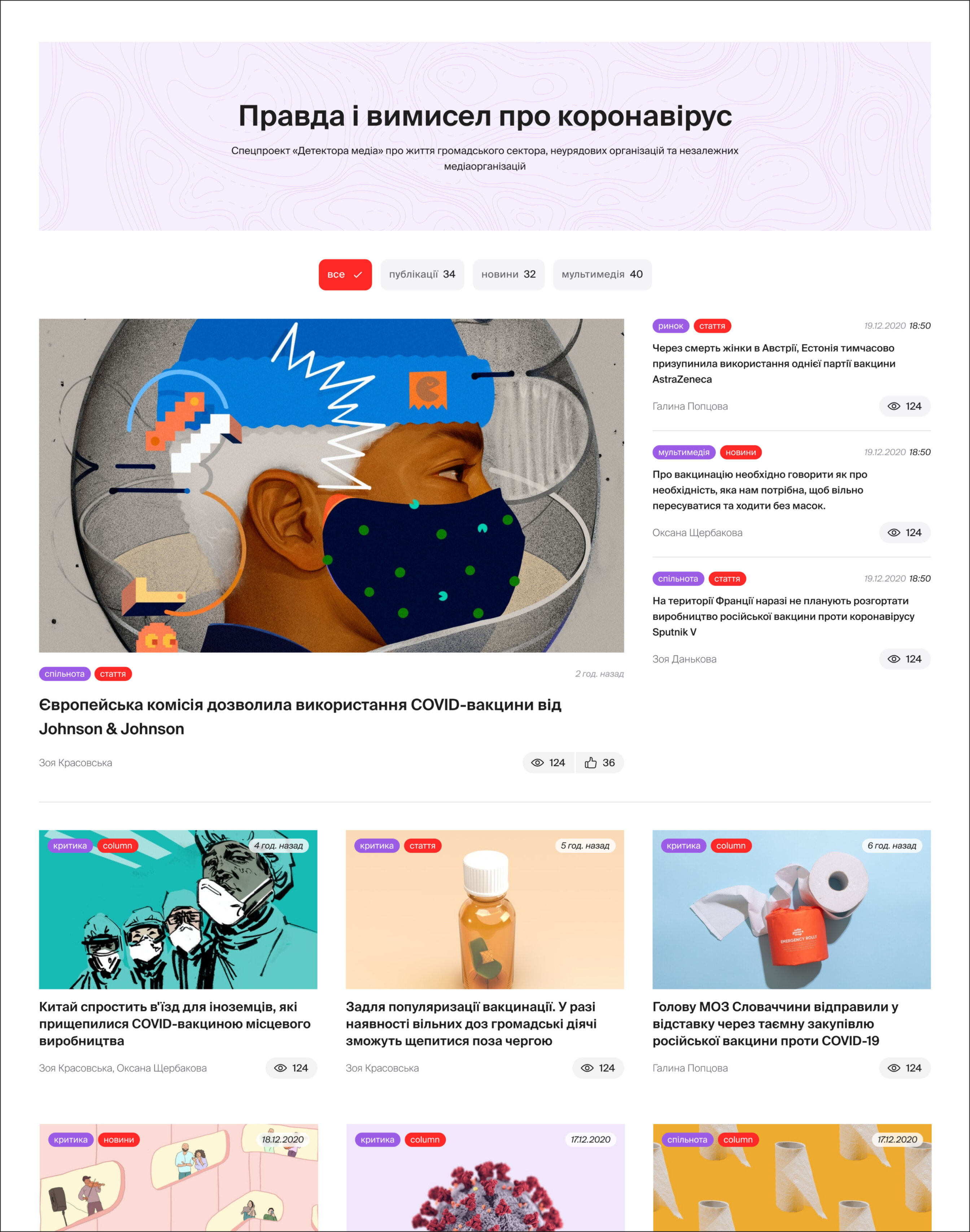
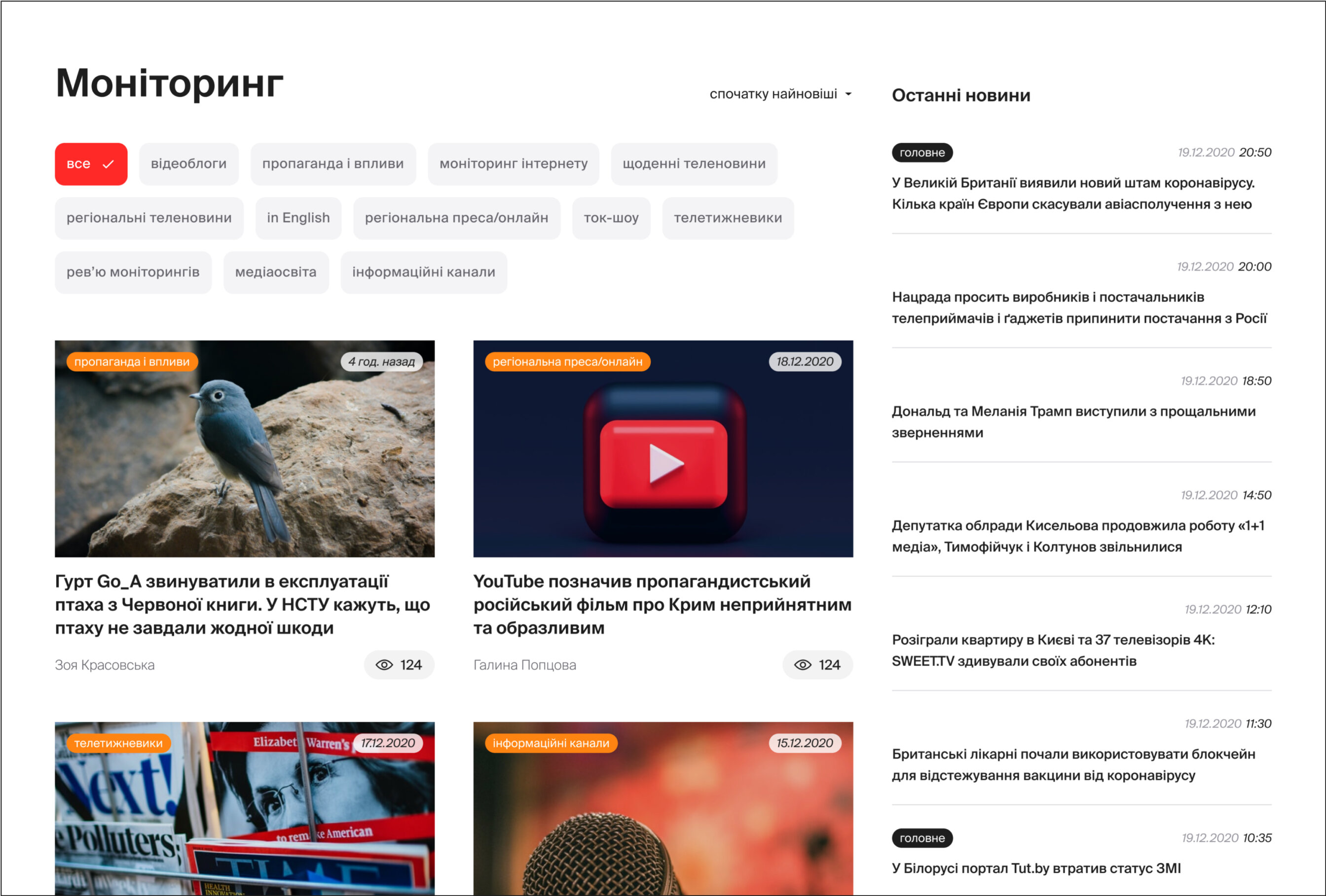
We created different types of articles and highlighted the main elements there. Our approach was to make everything easy to read and to keep the right accents.
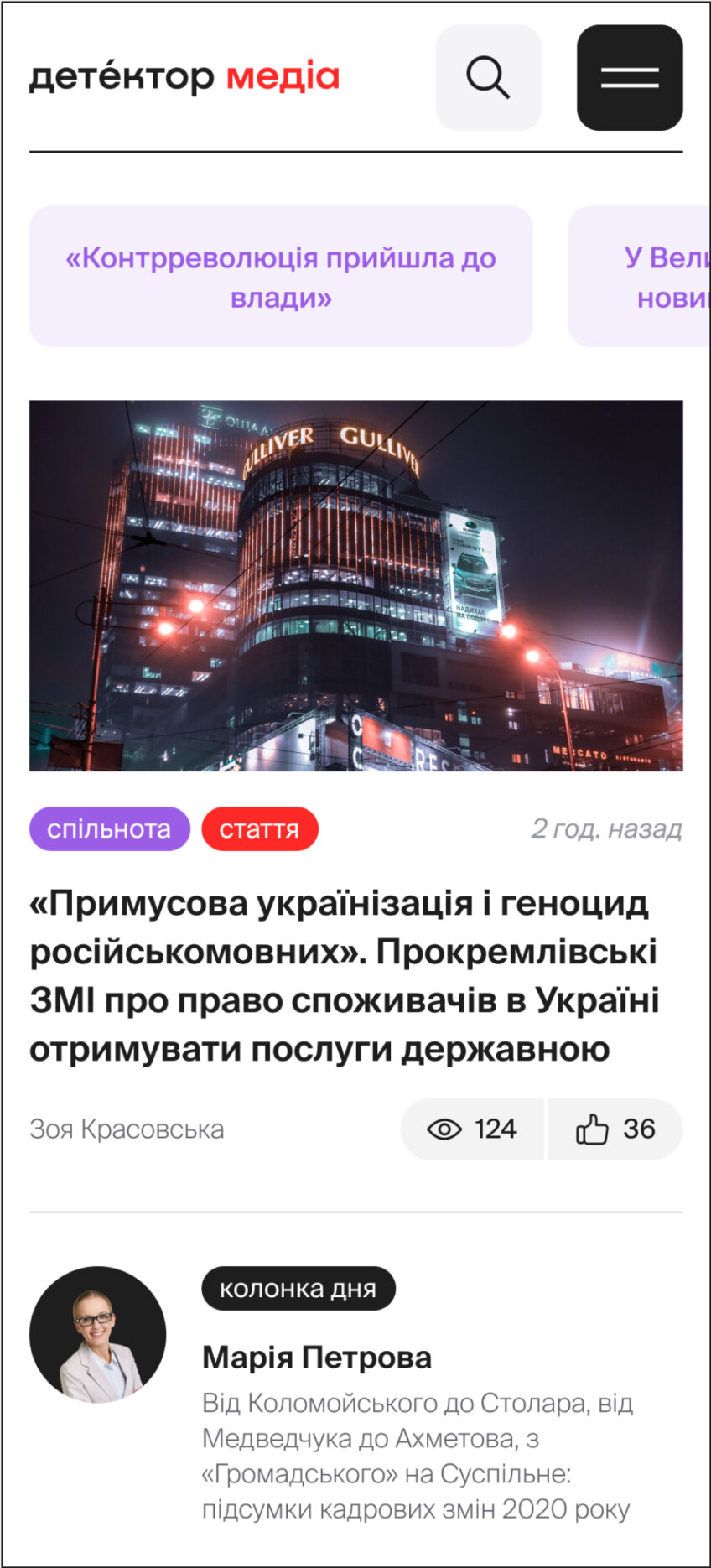
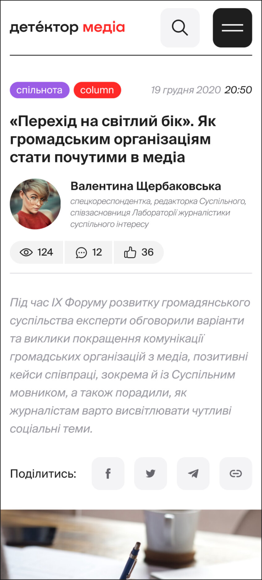
detector Media mobile
A large part of readers use their smartphones to read Detector Media. So we paid special attention to the mobile version, making sure the navigation is clear and logical, and that everything works smoothly and perfectly on all devices.
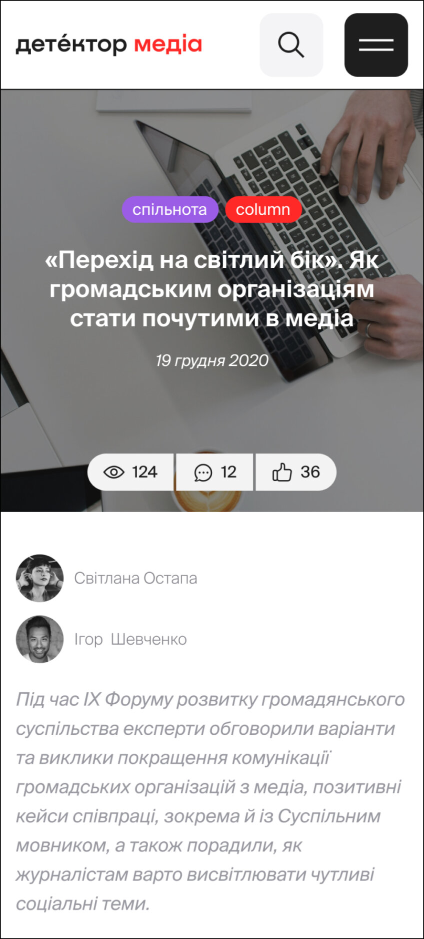
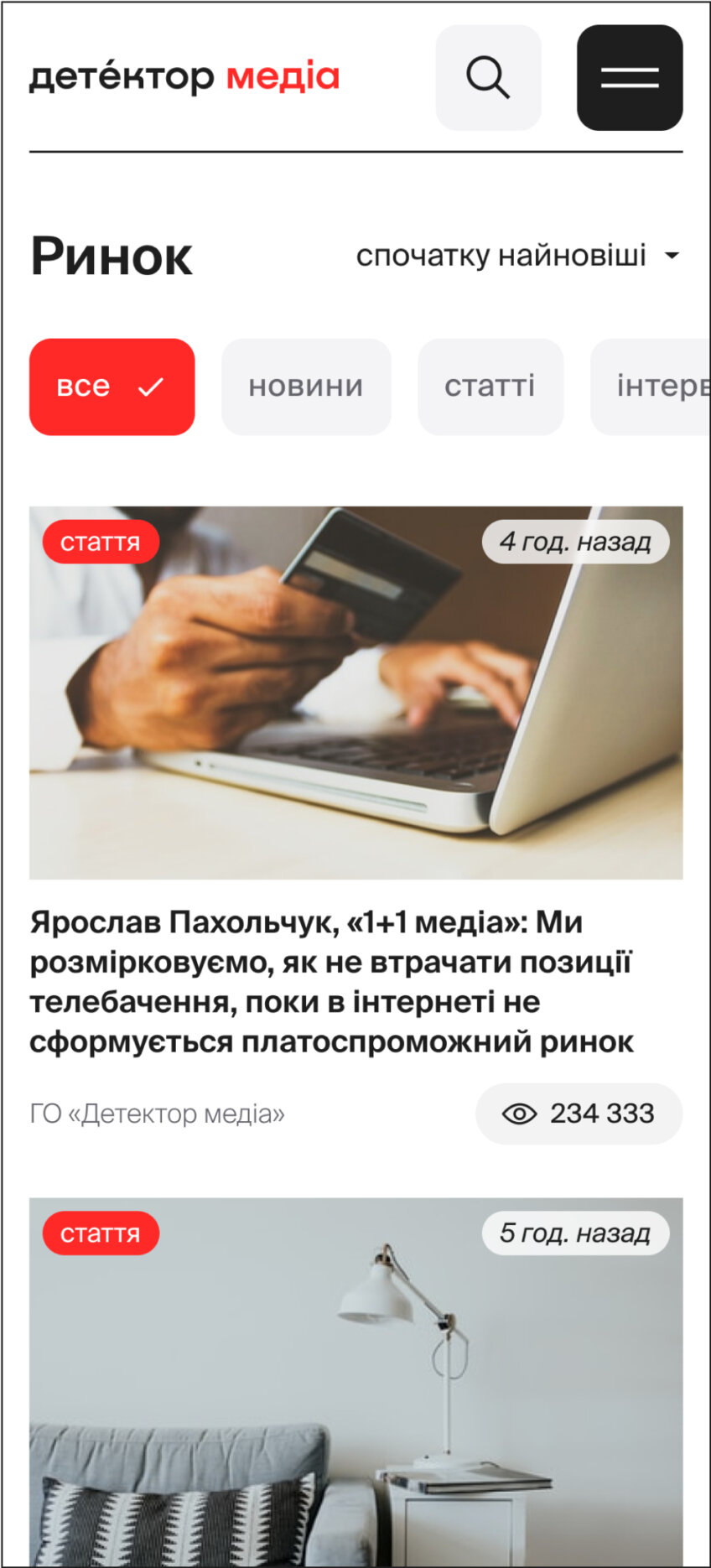
The final product exceeded the client’s expectations. zgraya digital delivered exactly what the client envisioned, and within the timeframe they promised. The team communicated remarkably well. Through responding quickly to emails and holding video meetings.
Project team
Art Direction — Valentyna Sulima
Brand Designer – Michael Babenko
Lead Designer — Oksana Minina
Designer — Olga Altuhova
Project Manager — Matvii Kurochka