Logofolio

ЗСУ, Ukraine, 2022
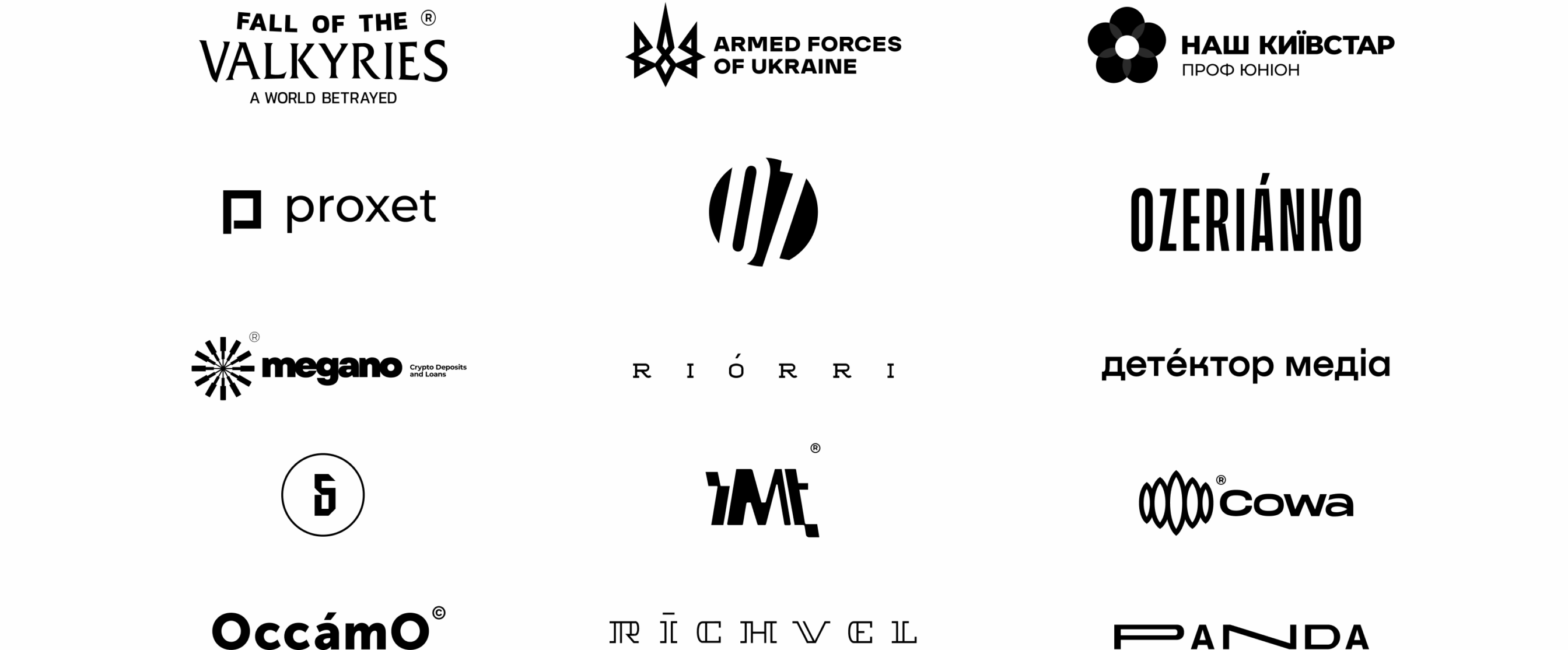
ЗСУ means ”Armed Forces of Ukraine”.

Fall of the valkyries, Sweden, 2022
NFT-game based on a fantasy world.

Наш Київстар, Ukraine, 2022
Professional Union

PROXET, USA, 2019
Proxet is a software company developing solutions for startups, SMBs, and enterprises. The company has huge expertise in AI, ML, Big Data.
For Proxet, we built a website, created brand identity, interface elements, and a logotype.
The logo and other brand elements convey the idea of Proxet’s innovativeness — which includes the designed color-coding and all this sticking to the “space” theme.

BIHUS, Ukraine, 2019
Made a website & visual identity for a media portal run by Denys Bihus, a Ukrainian journalist.
The aim was to develop a visual identity that would be new and fresh but consistent with the existing one. The outcome? We came up with a simple, recognizable logo system that works for all online and offline projects and formats.

PANDA, Germany, 2020
Panda is a German company that develops and installs equipment that helps industrial hardware not to break because of extra-high loads.
We created a modern light and memorable logo with a blue-to-pink gradient. For the modern audience that sees twenty-first-century technologies as their specialty.

MEGANO, USA, 2021
Megano, a crypto loans platform.
For Megano, we made a super simple yet symbolic logo. Each ray is a chain of blocks, and those rays form a rounded geometry associated with a coin. The beams symbolize the blocks being sent to the network. Because, you know, blockchain.

RIORRI, USA, 2019
For Riorri, a boutique with expensive clothes of various brands, we have developed a variant of unique lettering. Coming up with a laconic modern logo that has a visual anchor, an accent over the letter O.

OZERIANKO, Ukraine, 2021
OZ Bags is Daria Ozerianko’s brand of hand-made and unique bags, backpacks, and accessories.
Dasha, OZ Bags founder, wanted to update the brand identity and create a visual system for online and offline projects. Our idea was to combine the new style with the existing one and create a recognizable logo.
We reimagined the logo, radically revamped the brand label, and — you bet — got awesome results.

DETECTOR MEDIA, Ukraine, 2021
Detector Media is a watchdog of Ukrainian Media, looking over them all.
Guys from Detector Media wanted to refresh their identity, remove extra details from the old logo and improve its legibility.
We developed a website and visual identity for Detector. Refreshed and simplified their old logotype and added a modern font and red color.

IMT, USA, 2020
For IMT, an American investment fund, we designed a logo in a unique lettering format. The color and shape of the logo are to emphasize the central identity of the company and its experience.

COWA, Norway, 2021
Cowa is a nature-friendly Bitcoin mining company.
We created a vivid website in the style of northern lights to represent the company’s high-tech approach & environmentally-sound operations.
The logo sign also represents the northern lights associated with green, pure energy.

RICHVEL, Italy, 2020
Richvel is an Italian travel company that focuses on organizing cool luxury trips. The company’s name is a merge of two words — “rich” and “travel”.
The choice of colors is based on the analysis of the target audience. And also there is unique lettering in shades of deep blue.

Occamo, Ukraine, 2020
Occamo is a Ukrainian architecture studio that works on the principle of the Okamo razor — it cuts off everything superfluous. Exactly what the company wanted to show in the logo.
We created a concise logo to convey the idea the guys are guided by. The logo is black and minimalistic complemented by the descriptor.
