Cowa
project website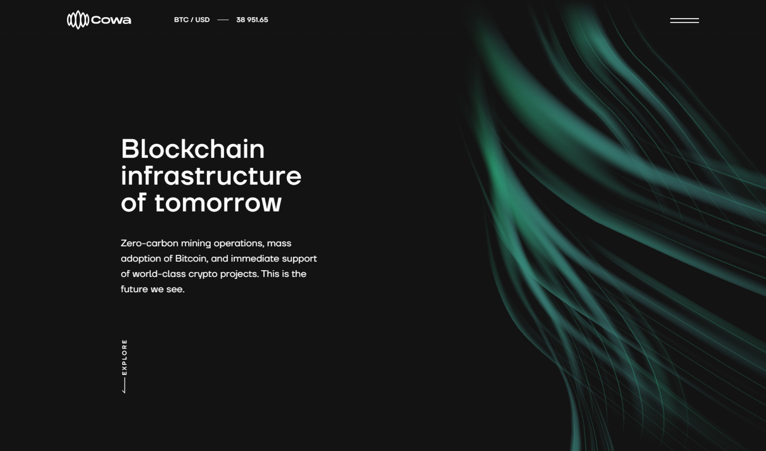
Idea and the task
For Cowa, there was a lot to do. We came up with the name, crafted a logo and visual branding, verbal identity, designed and developed a website full of 3D graphics.
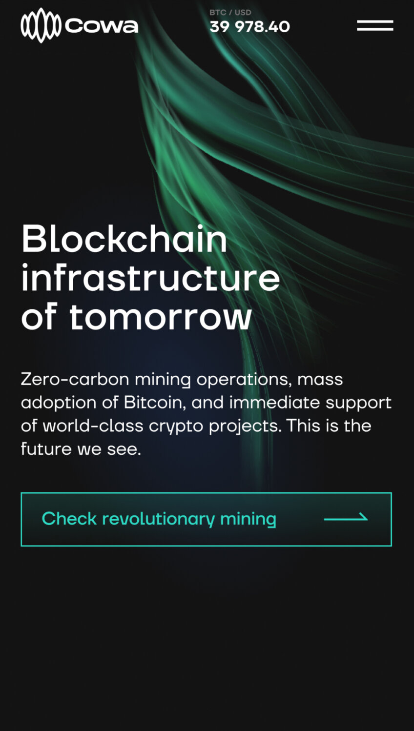
Since Cowa is all about respect for nature and a carbon-free approach, we moved in the direction of renewable energy. The idea was to use the image of the northern lights, which represent both nature and energy.
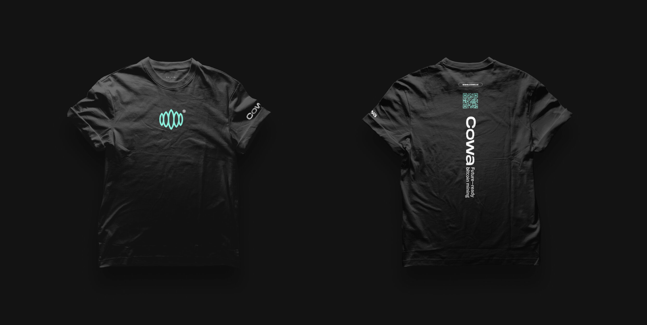
Logo and branding
A logo sigh should be laconic — or it will be too difficult for people to remember. And, thus, may not work well. So we didn’t draw any realistic and complex shapes of the northern lights here but used their general visualization.
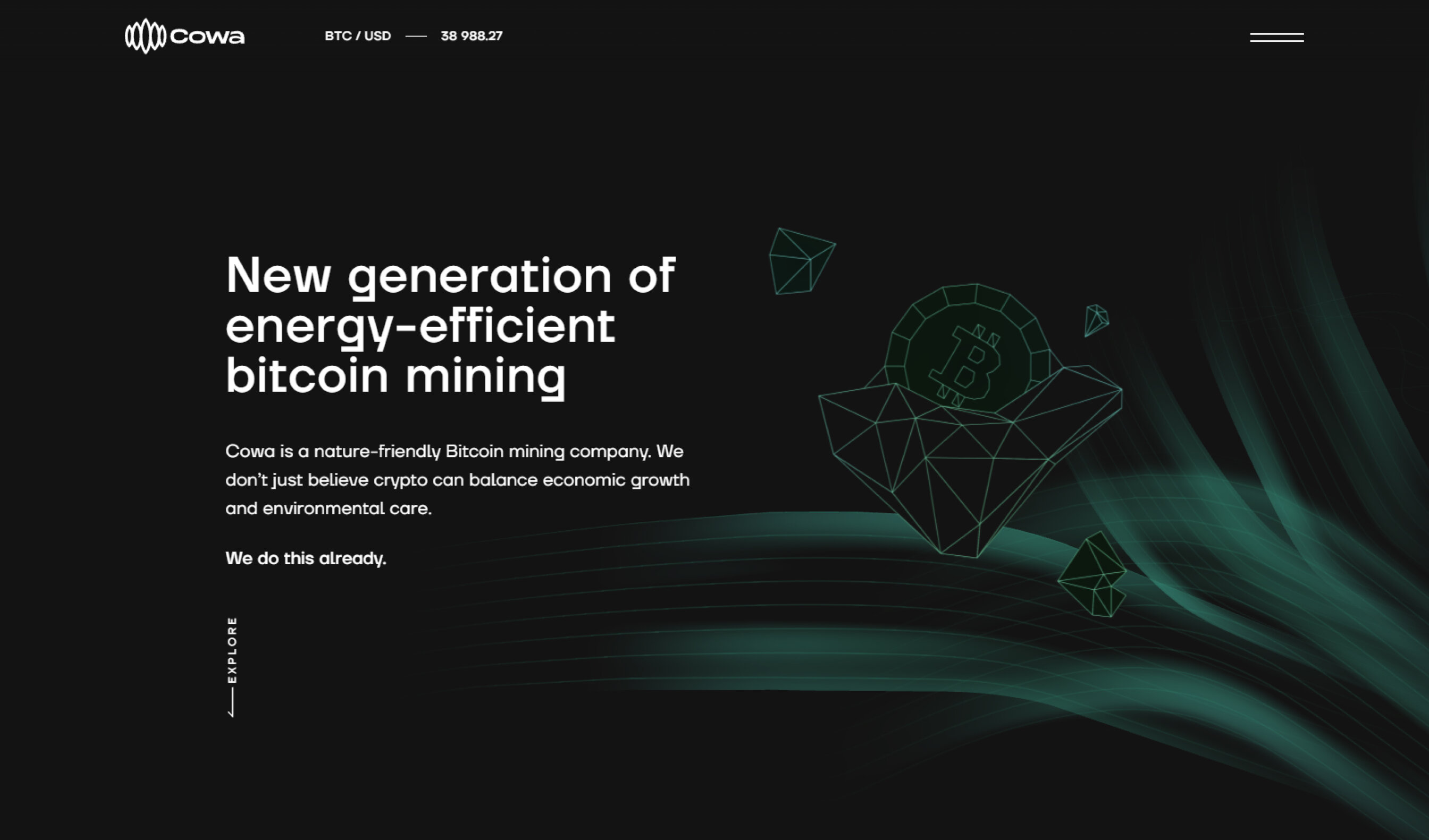
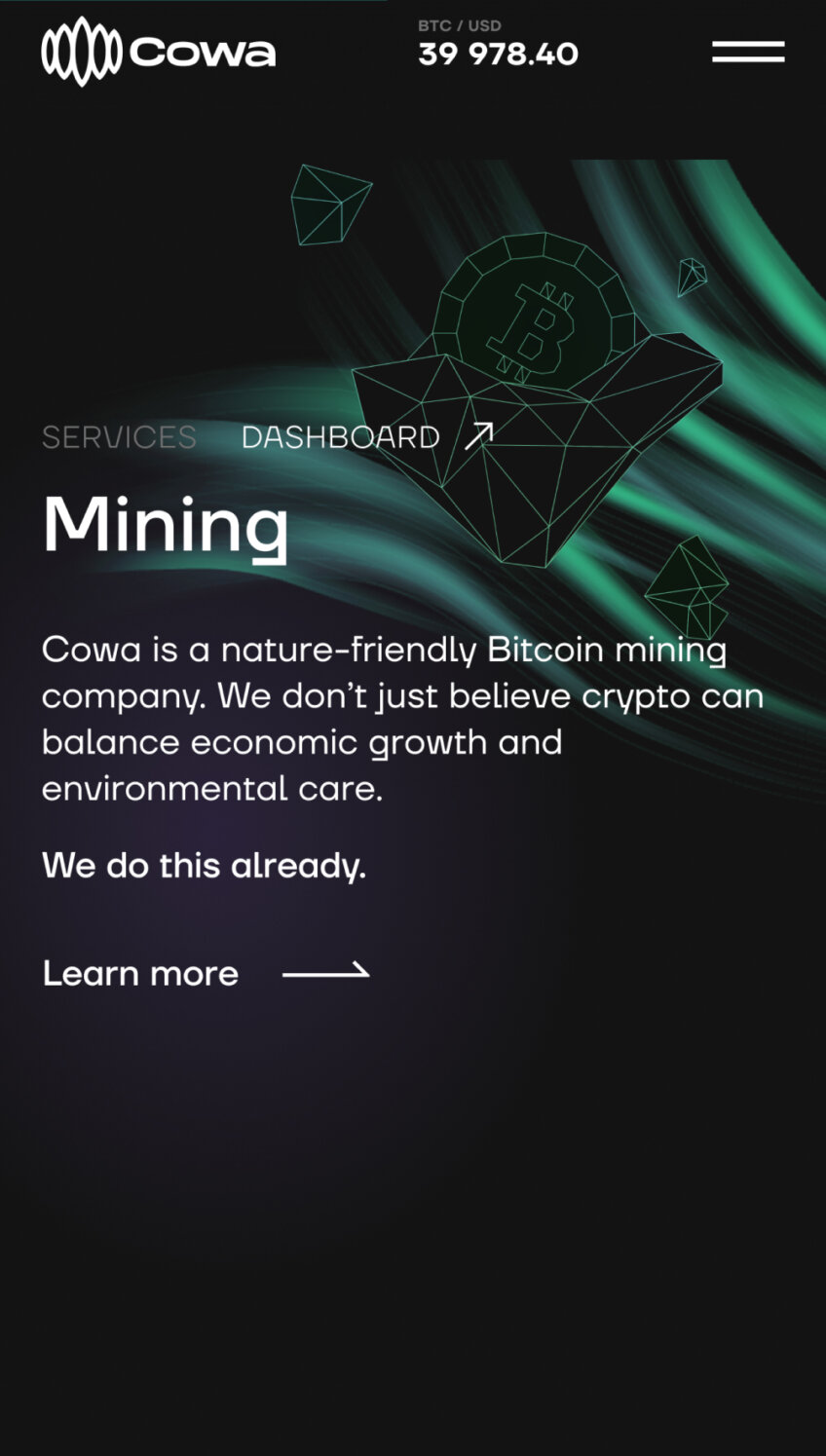
Icons and illustrations
The website design is full of linear 3D shapes that represent the techy side of the company. We played with the idea that the northern lights represent energy that fuels all the site elements. Just like hydro energy fuels Cowa’s mining equipment.
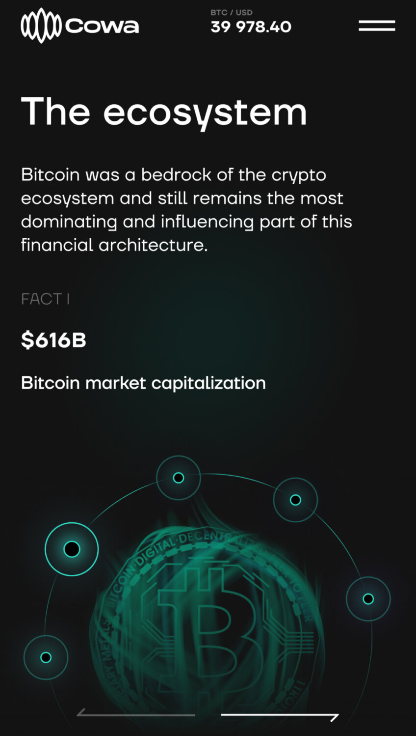
Before this energy appears — by the scroll — users only see lifeless skeletons of objects.
Optimized for mobiles
As always, a website we worked on rolls off the line with a decent mobile version. We adapted all the visual elements for many devices and replaced animations with static images. They are lighter and faster to load, even if visitors’ internet speed is Norway-far from satisfactory.
Project team
Brand Design – Aleksandr Samochёrnyi
Art Direction, Design – Vladimir Klunnyy
Copy – Maria Diachenko
Management – Masha Push
Development – Alexey Kalyuzhnyi, Victor Kolesnik