Fall of the Valkyries
Logotype
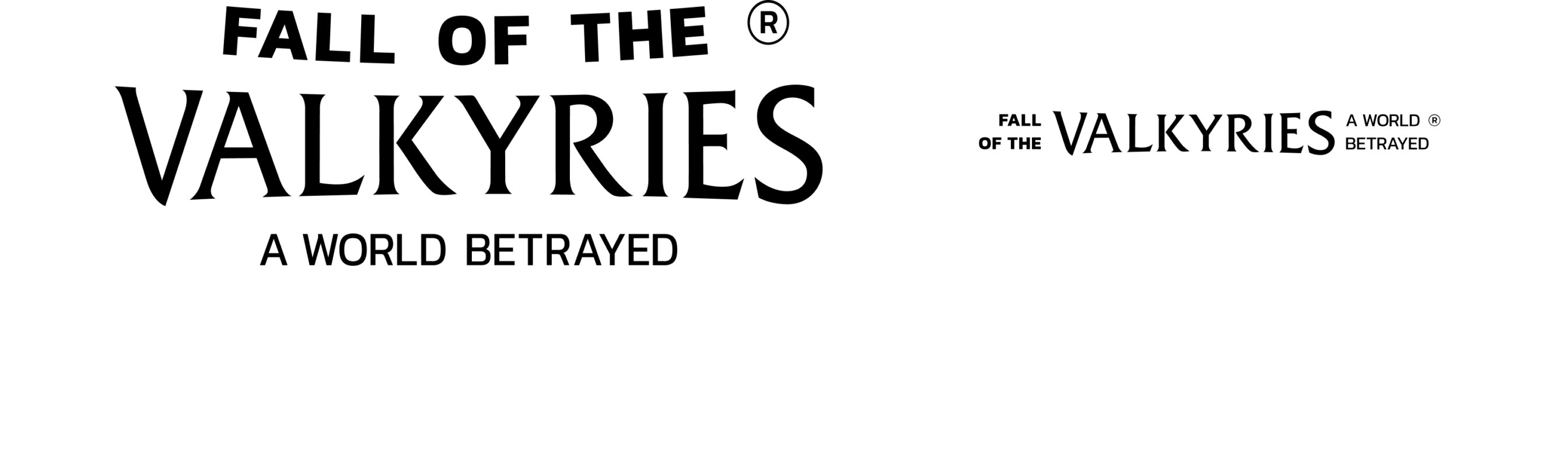
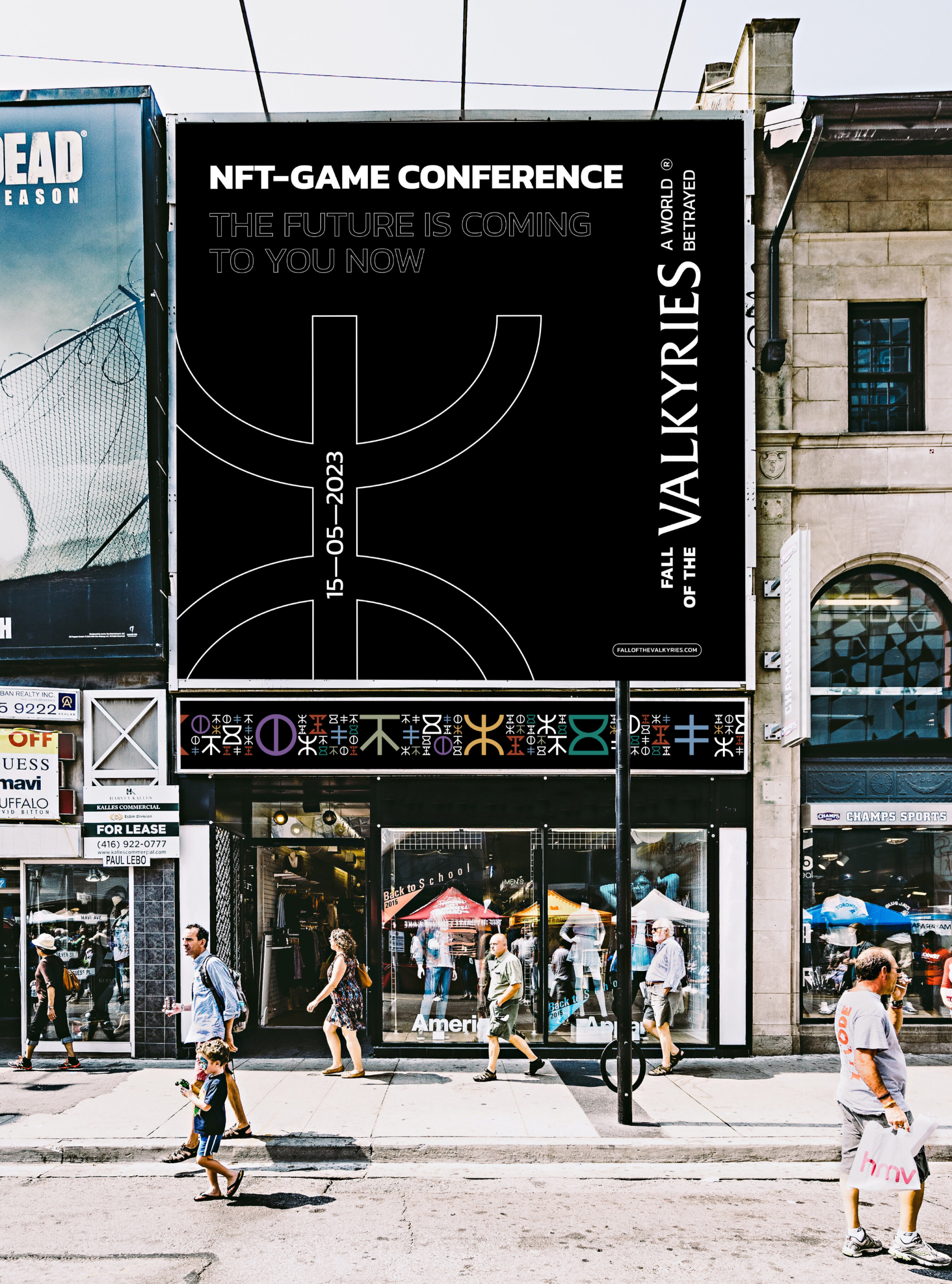
The logo we came up with is made in the lettering format to match the game’s style and the legends’ aesthetics.
It has only a text part without any additional characters for the people to pay attention to the game’s name. The curvature of the text parts gives the logo a more attractive look — and a more playful nature.
The challenge here:
➔ The new identity must be flexible and adaptive;
➔ Look good for both customers and potential investors;
➔ Be modern and, at the same time, represent an in-game fantasy world.
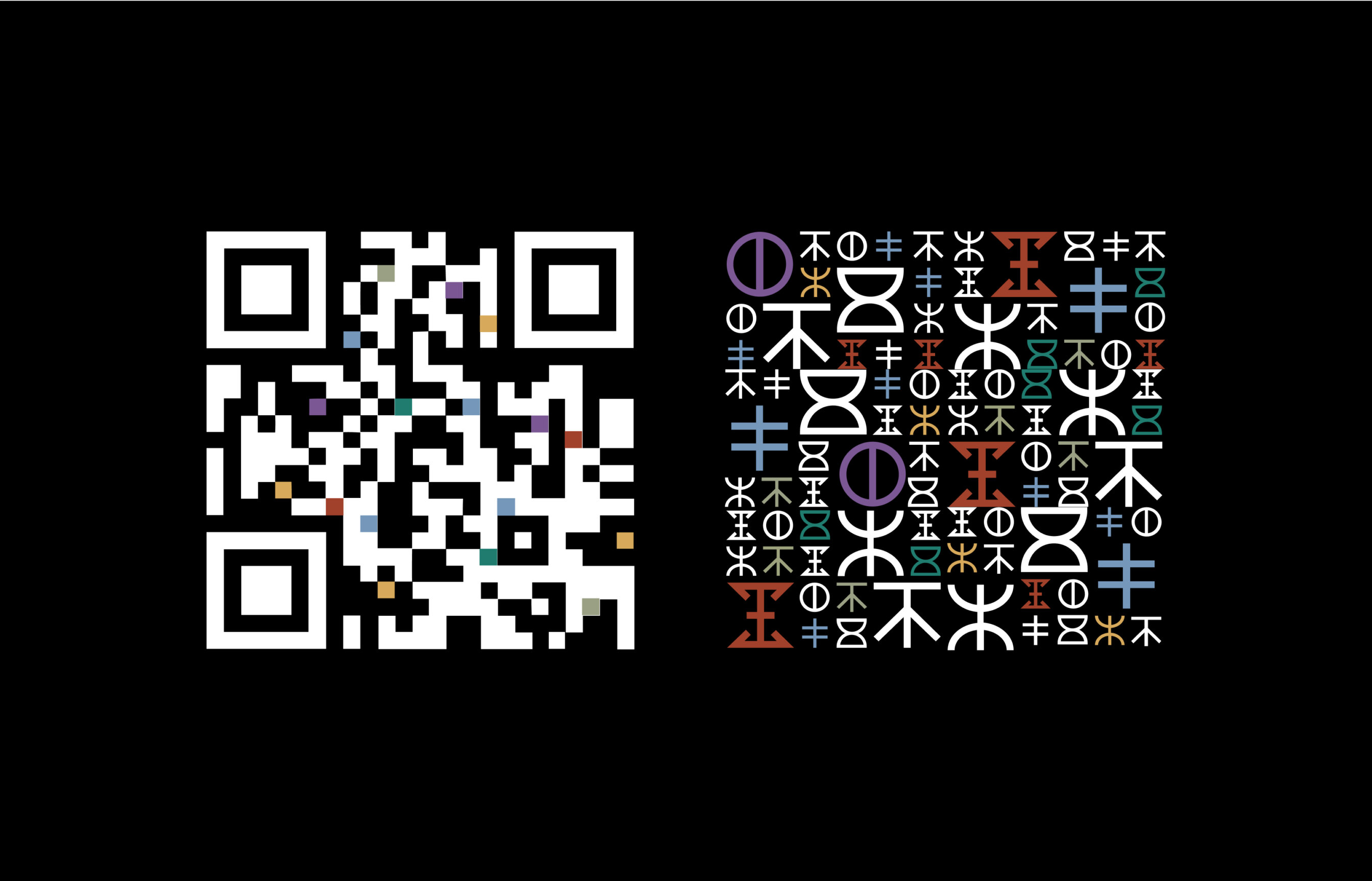
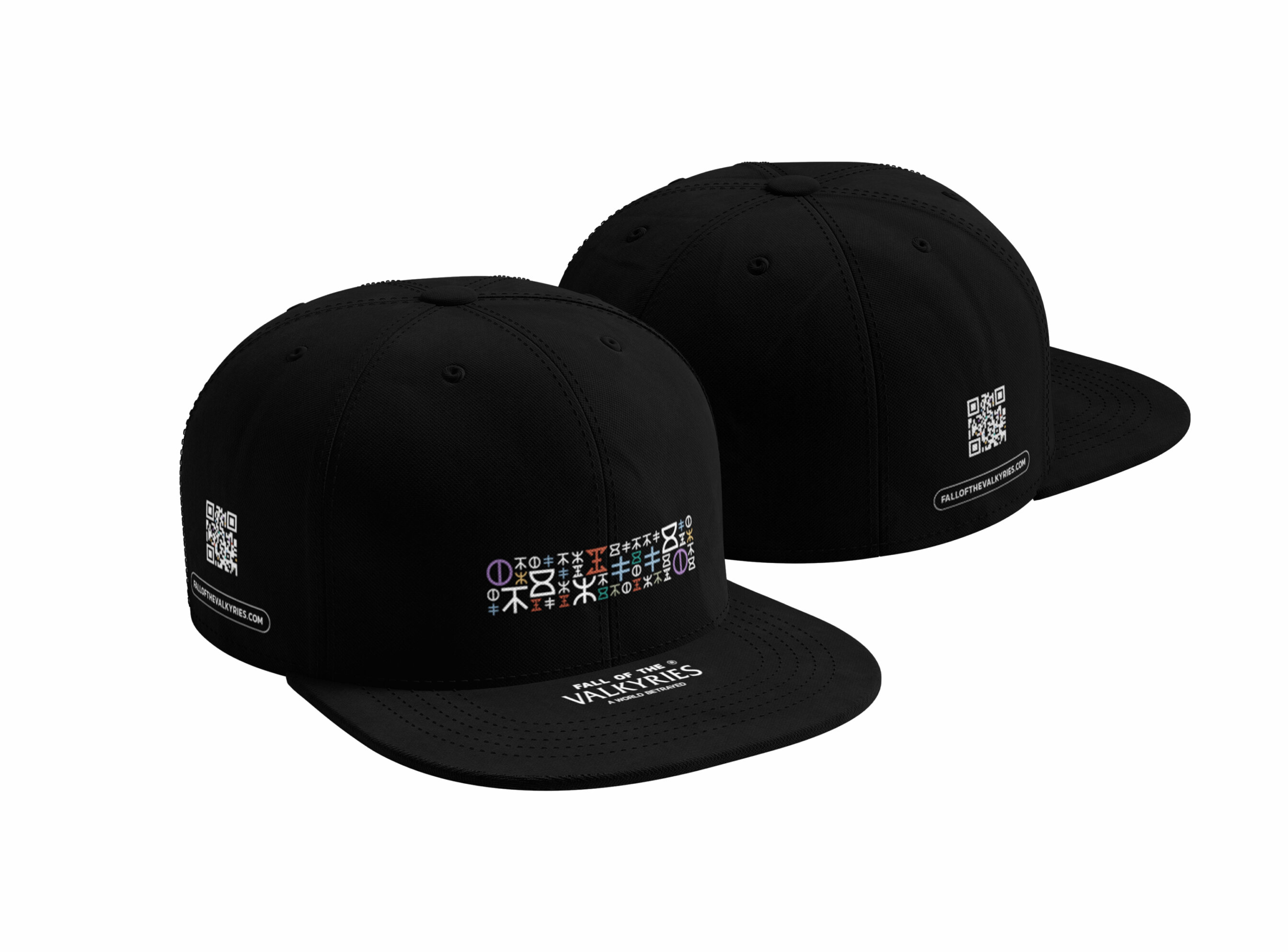
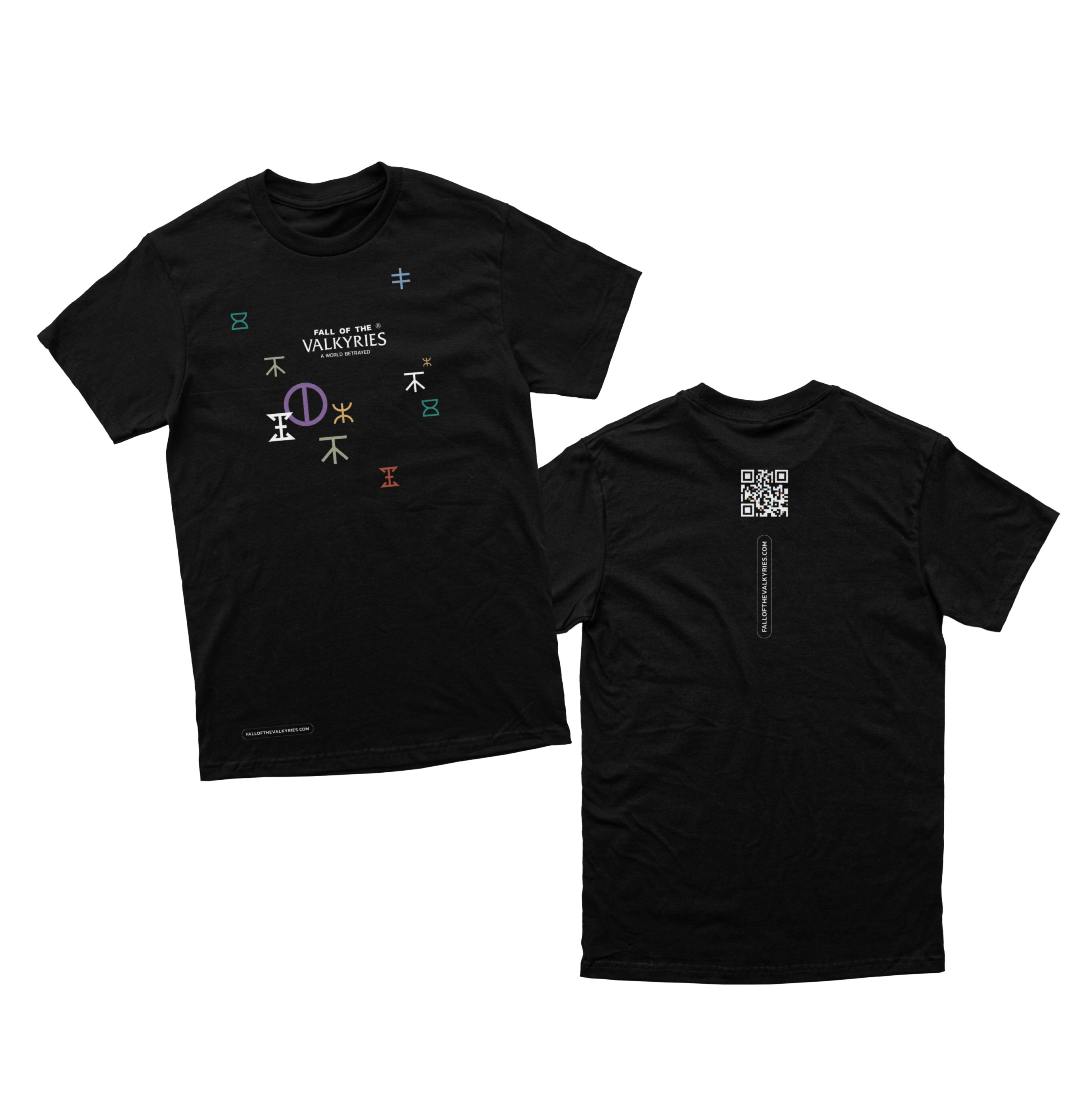
branded qr code
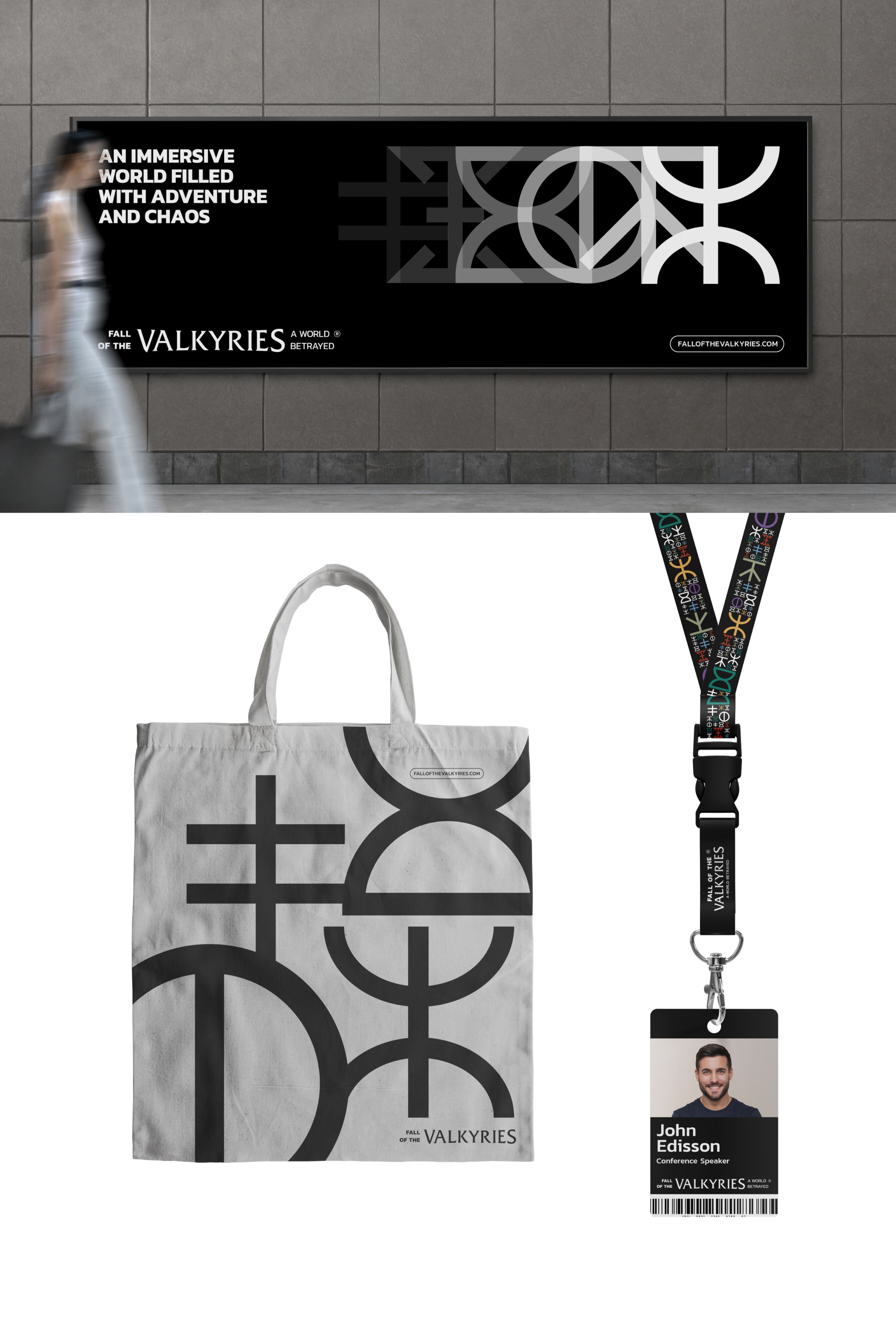
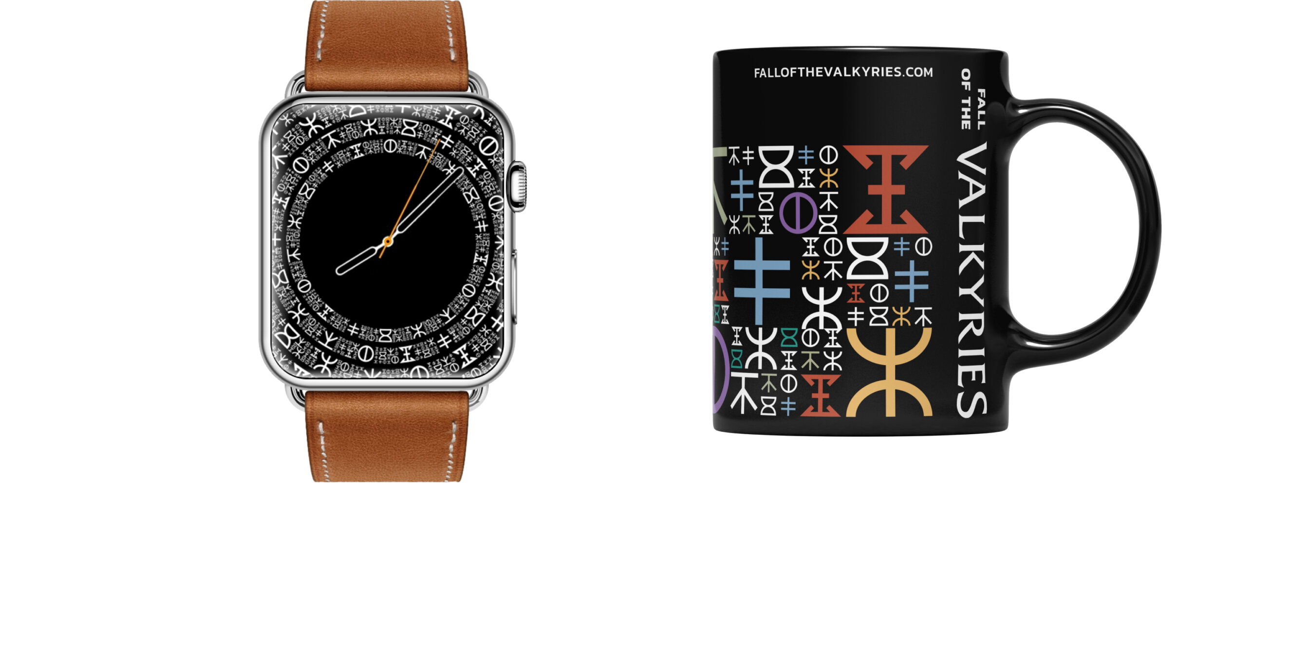
We created a custom QR code that now includes corporate identity elements. For, you know, consistency reasons.
QA codes are often used for the merchandise. And it’s very cool, unusual and eye-catching to see something different from the black and white pixel patterns everyone got used to.
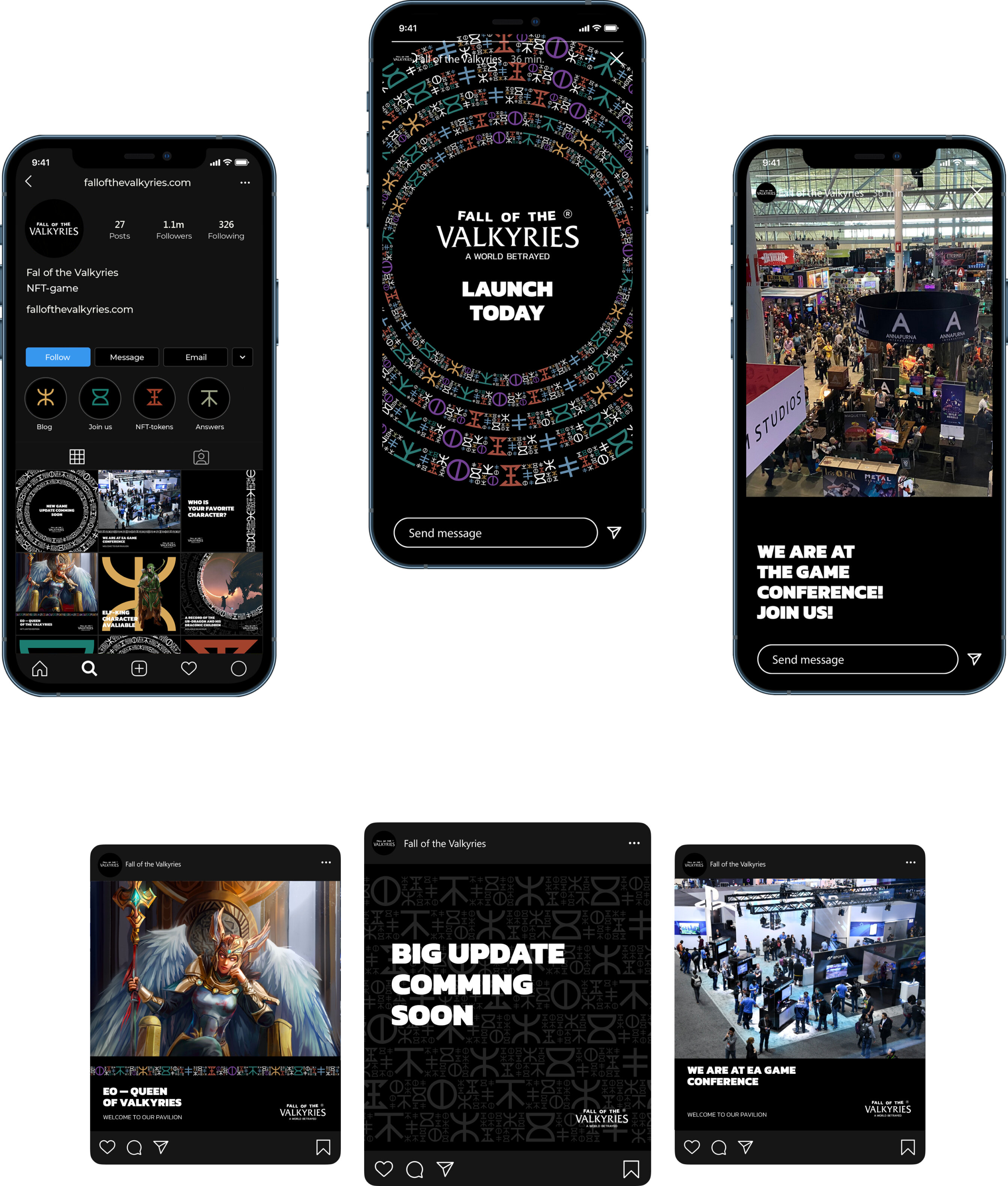
social media
Project team
Art Direction – Samochernyj Oleksandr
Brand Design – Kostiantin Solodukhin, Samochernyj Oleksandr
Animation – Kostiantin Solodukhin
Copywriting – Masha Diachenko
Project Management – Dmitry Drozd