IP Global
Colour & style
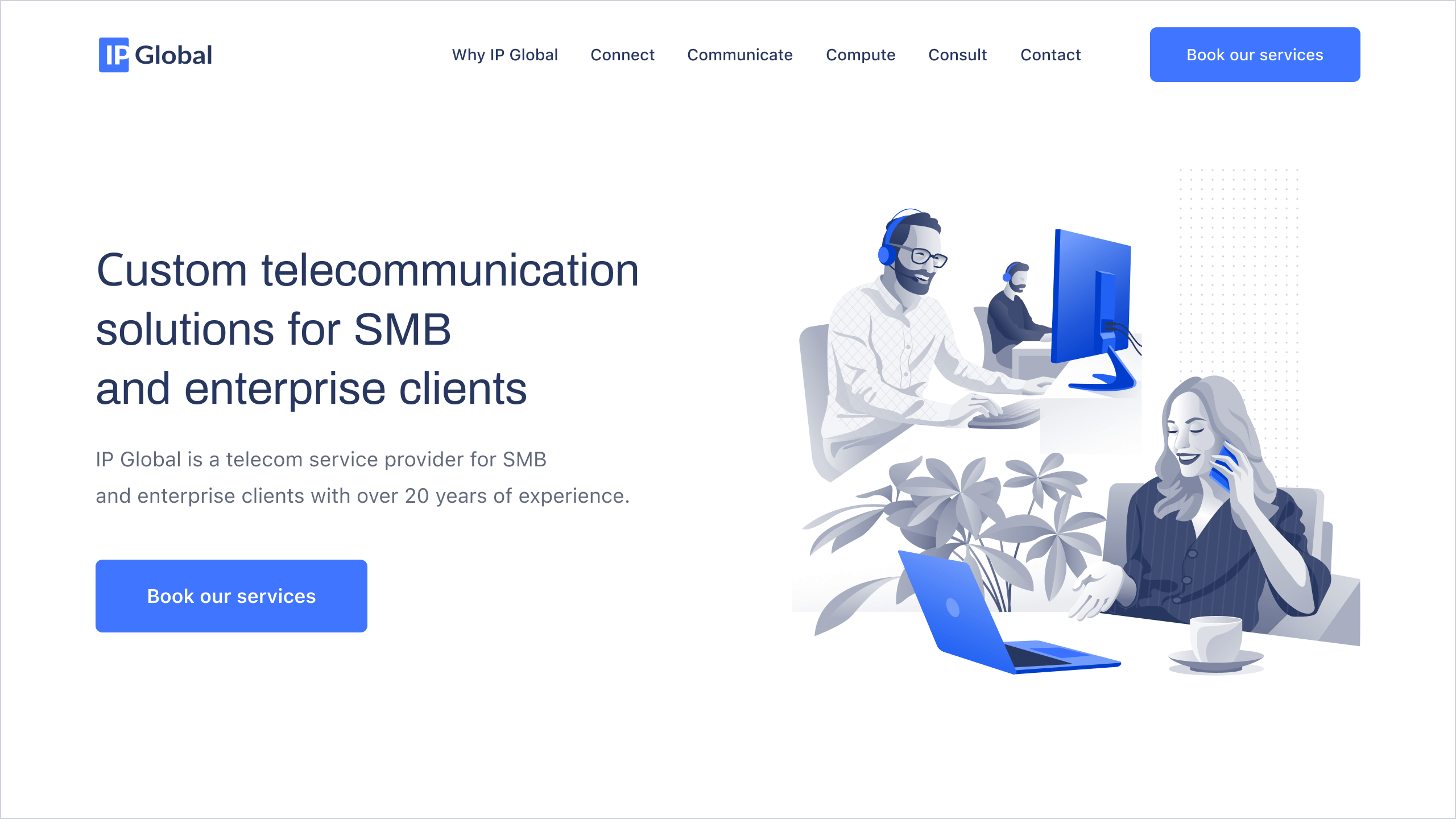
On top of the minimal corporate monochrome design, we used blue elements to convey reliability and professionalism. Blue is good because it’s very neutral and calm, that’s why it’s the favourite colour for a lot of people.
We needed a simple, recognizable logo, which had to be used in a lot of places and would fit any context in any size. We used simple but strong minimal fonts and simple lines and added the same blue colour.
Diagrams & illustrations
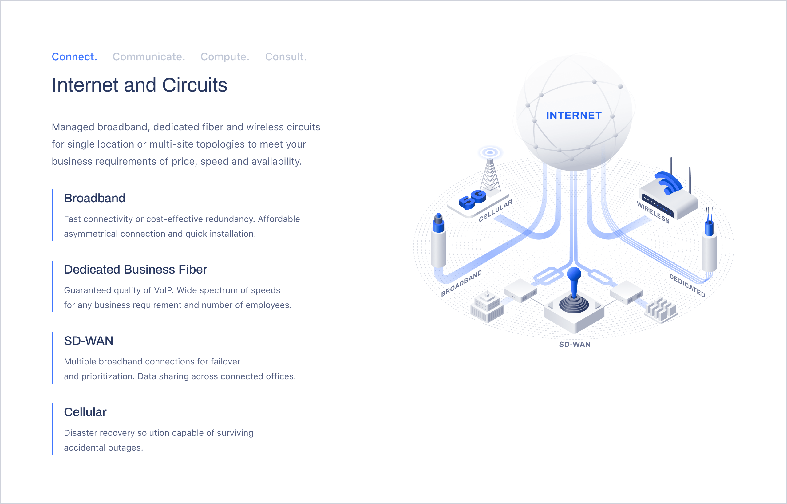
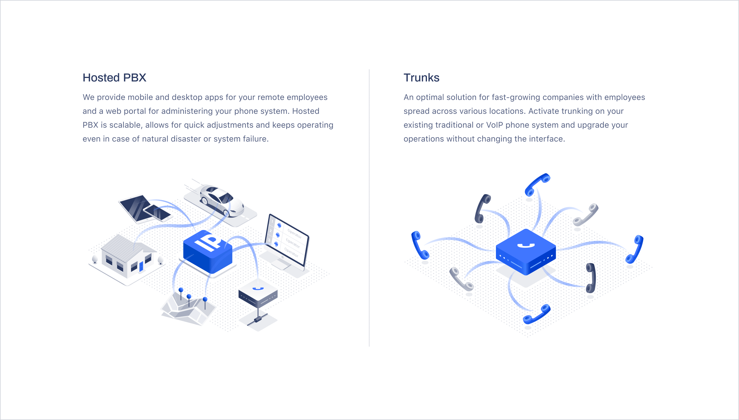
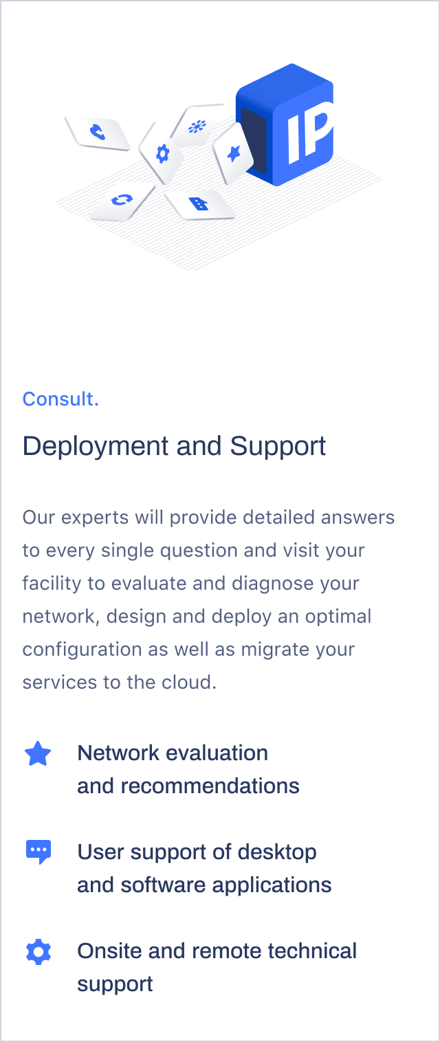
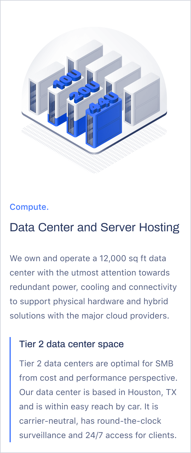
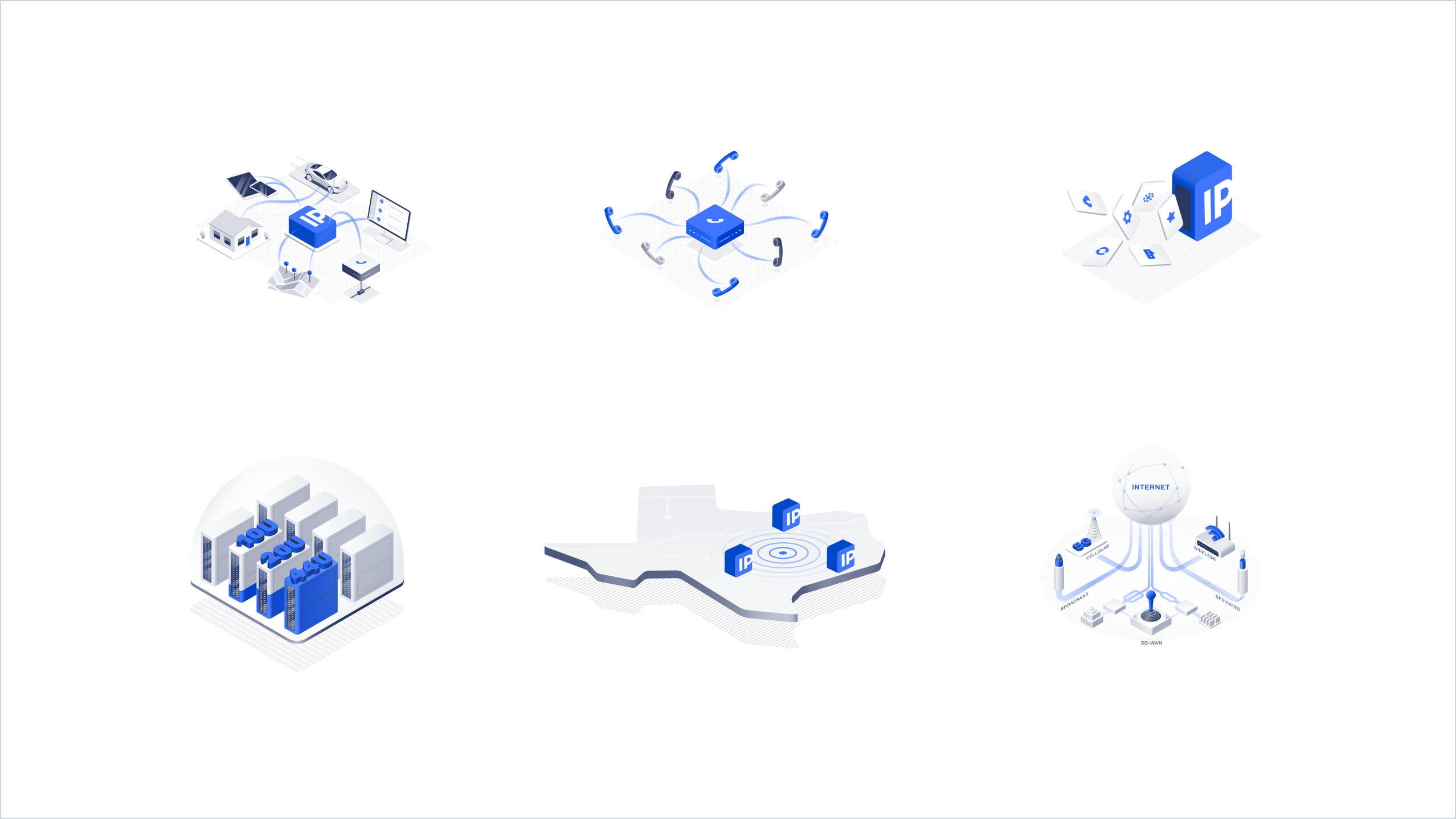
We added a bunch of hand-drawn illustrations and reimagined the diagrams, not just for style but also for clarity. So we had to really understand what’s going on in terms of the technology in order to complement the text in the best possible way.
We also did a lot of work on the copy. We took the old website with a lot of technical information and reworked it in a clear, simple way that could be understood by non-technical people.
Function follows form
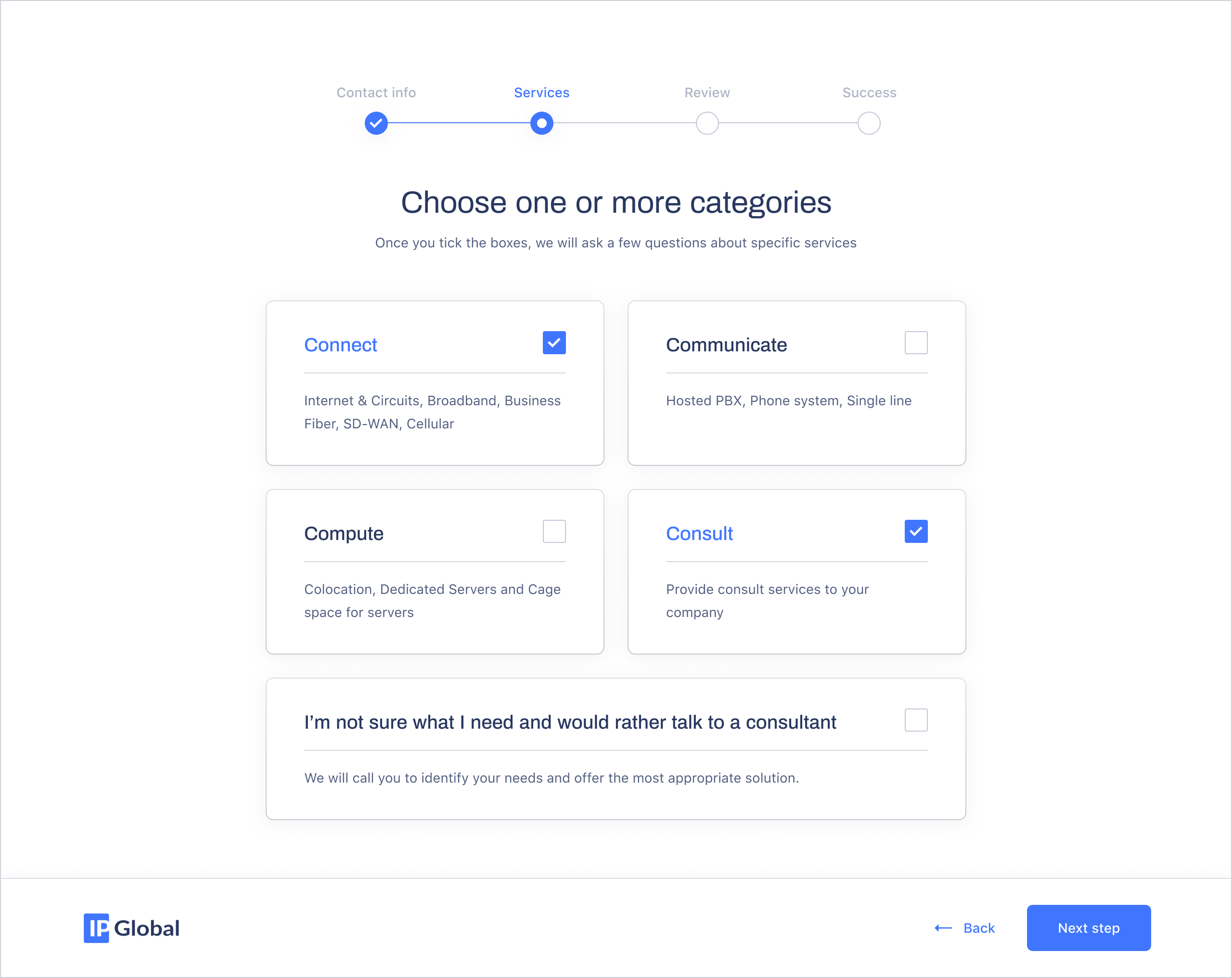
One challenge was to simplify a massive contact form that included a lot of input fields over several screens. We added the ability to choose what to fill and what not to fill, to the point where a person can avoid filling in the form altogether and just ask for a callback instead. To each his own.
Project team
Art Direction: Yulia Snitko, Vladyslav Orlov
Branding: Valentyna Sulima
Design: Vicky Hladinets, Victoria Martynuk
PM: Natali Gorodetska
Copy: Valerie Karahan