Not by Logo Alone: Visual Branding & Identity 101
If you’re the one and only company with no competitors ever, branding is optional. When people have no choice, it doesn’t matter whether your app or a website comes with a cool logo and specifically selected colors or not.
But if your company has at least one competitor, chances are you need brand design.
P.S. Check the updated Logofolio here.
We’re briefly uncovering the core elements of visual brand design — logotype, identity, guidelines — and why all-size companies should even bother.
What a logotype is for, really?
Long story short: a logo helps the audience visually identify your company. That is its primary role.
People see a bag with your logo, they’re aware that your brand exists. If they like the bag, next time they need one they’ll probably think of you. See your logo, and grab another pair of your bags.
Long story long:
The logotype reflects the nature of the business and helps to stand the company out from the crowd. A good logo gets attention; it’s ‘catchy’. Just like when we hear Apple or Adidas and the bitten apple or three stripes come to mind.
All brands need a logo. Even if it’s a small startup that sometimes goes out and talks to people. Not having a logo means you are hard to remember, really hard to identify, and borderline impossible to figure out what you broadcast to the audience.
Without consistency in how a brand looks, there’s a risk of losing clients, not scaling the business as quickly as possible, and also underearning as people will find it hard to single you out.
a logotype isn’t only for distinguishing a company. A logo increases awareness. And the associations your brand forms are going to ‘stick’ to your logotype.
If your products are good, the prices are reasonable, and in terms of marketing and business you are no worse than your competitors, then a quality logo distinguishes you AND brings new customers.
Depending on where your business is at the moment there are different ways to approach getting you your perfect logo. Here are some of them:
#1. Creating From Scratch
The first thing we do here is collect information about a client’s business: the industry, target audience, business objectives, competitors, and more.
We’ll ask you to fill in a brief (just like this one). It’s a general template we customize for each new client, depending on the info we already have.
After we study the brief, do our own research and break down competitors’ branding cases, we get down to drawing logotypes. Usually, we get up to three different logo options ready in the process.
We can also develop calligraphic (lettering) logos if they’re relevant to a company brand.
Then we run the logotypes through a checklist:
- Does the logo correspond to key aspects of the brand’s target audience?
- Does the logo match the brand’s marketing needs?
- Does the logo comply with the tech restrictions of physical promotional materials?
- If the logo uses a ready-made font, does the use of that font comply with legal requirements? Does it violate any copyright laws?
- Does the logo stay legible in a small size?
Only when each of the three logos passes the test, we put together a presentation, showing and explaining the idea behind every option. We also usually include a few examples of how the draft logos might work in real life on real-life objects (cups, hoodies, banners, cards, and more).
Now, the logo itself can be:
- Calligraphy or lettering logo (inscription with a unique hand-made font)
- Traditional (text part + a sign)
#2. Restyling
While creating a logo from scratch stands, well, for creating a logo from scratch, restyling and redesign are about changing something in existing logotypes.
Restyling means adjusting the logo to the current trends without globally changing its sign or text part.
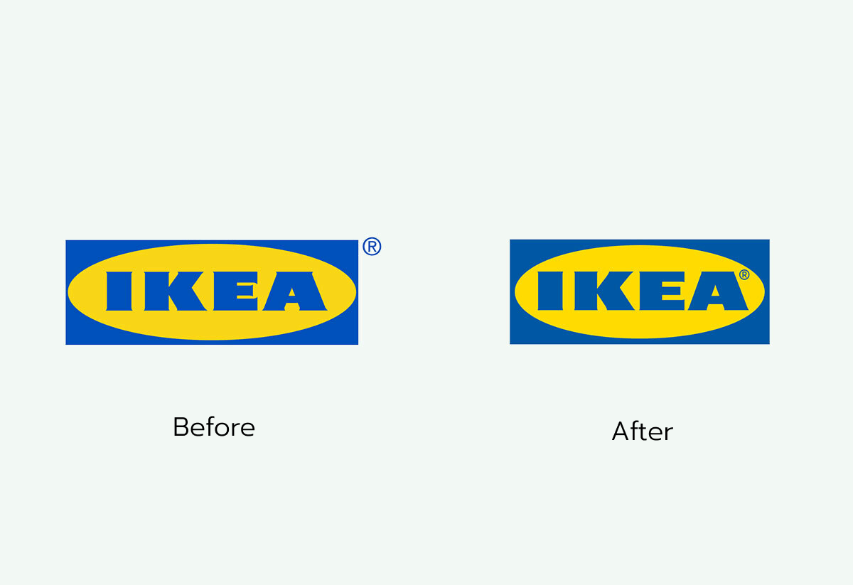
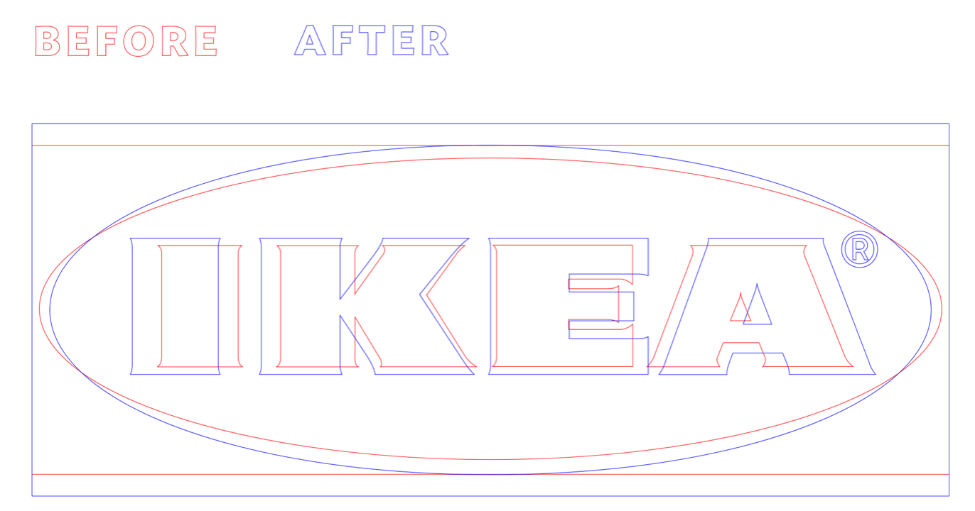
Like the IKEA logo that was transformed to keep up with the latest design trends. From a typeface with serifs on the left to a modern minimalistic version on the right with smaller serifs and letters looking more open.
Brands do this when they need to correct the font and/or the sign geometry while keeping the image and the meaning intact.
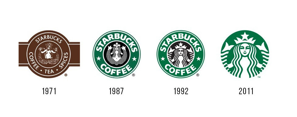
Why? Because logos become obsolete in time. The fonts and geometries the world goes crazy about today won’t be the same in a couple of years. The world is anything but static, so most of the world-famous companies slightly restyle their logotypes every 3-5-7 years.
#3. Redesign
Redesigning means we don’t change the brand or how the brand speaks to its audience, but heavily adjust the identity. It’s about doing much more work compared to restyling, often — completely rethinking the logo.
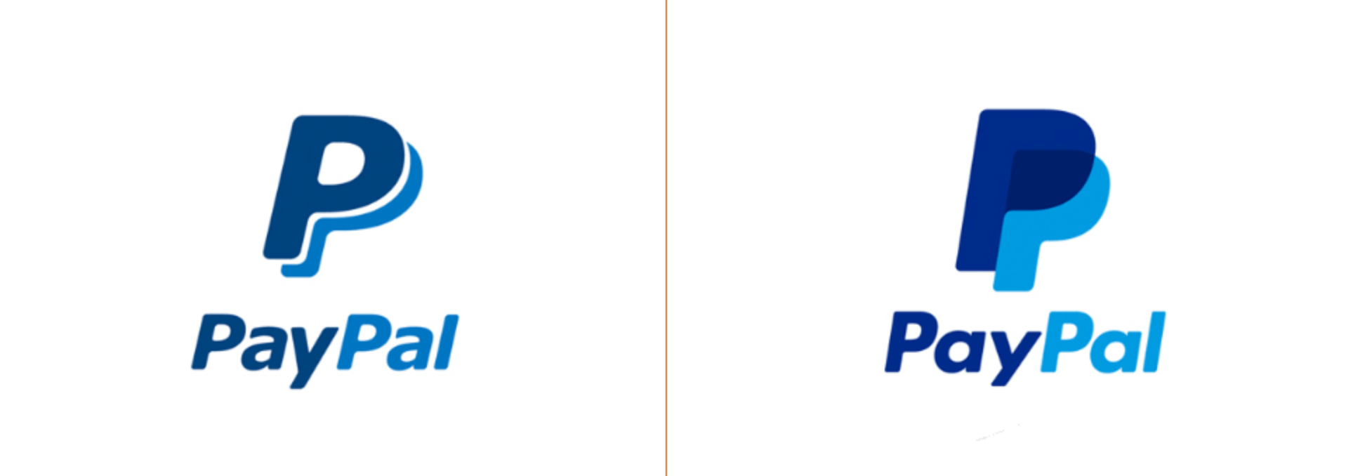
Just like PayPal once did:
Usually, the marketing part of the brand (platform and strategy*) does not change with a redesign. It’s the logo that needs changes — either because it’s outdated or does not work as it should anymore.
On average, brands do a logo redesign every 3-5-7-10 years.
| * Brand platform and strategy stands for the target audience of the brand, mission, philosophy, values, how the brand will be perceived by the audience, further plans of brand development. |
#4. Rebranding
Rebranding means changing not the brand’s design, but the brand itself — its marketing part, its tactics, and goals. And when a company radically changes its brand, it also requires changes in visual communication tools. Yep, like the logo.
So, rebranding is not about the style of brand design but the strategy. It’s the first thing that changes when rebranding happens, for various reasons.
Some even go for a complete rebranding. For example, today McDonald’s is a family brand. Should they decide to target only zoomers, they will need to develop a new brand strategy and form a new brand identity. And in most cases, it means completely redoing the logo.
Another example is the fashion industry. Luxury clothing brands actively target a less orthodox and more twenty-first-century audience, and rebranding is bound to happen.
Summing it up, here are the options you have with a logo:
- Designing from scratch. You have no logotype, so we study your brand’s marketing request, business, and audience, then create one.
- Restyling. Adjusting an old-fashioned or improper logo to modern standards & trends.
- Redesign. If the logo doesn’t correspond to your brand’s tone of voice or doesn’t work for the target audience, we redesign it.
- Rebranding. Re-doing the marketing part of the brand as well as its logotype.
Visual identity, and why so serious
Visual identity is another thing that sets a brand apart.
Coca-Cola is associated with red, Apple with a bitten apple, and Google with a multicolored font. Logos, brand colors, typography, patterns, illustrations, and even sounds and aroma make a brand special and recognizable. They all form an entire visual communication system.
Like, here’s an example of a digital one (check out Google’s awesome visual guide here):
Brand identity helps to keep all the brand materials, printed materials, online and offline ads consistent. People see your billboard and if they know your brand, they know it’s your ad. Not brand A’s, not brand B’s, not “hey, what’s that?” brand’s. Yours.
Same with fonts: they help to set the mood, the tone of voice (see how informal this site looks!), the style of your company. And can even influence the style of your products.
Another real-life example of why visual identity stuff is important.
We got used to driving fast, dashing through social media feeds like there’s no tomorrow, taking one quick look at the products on store shelves, and that’s it. Because the number of products and the amount of content around us are. just. enormous.
Here’s how our adapted brains ‘see’ a supermarket shelf:

Сolors spots, not products.
The first thing we focus on when studying everything that comes into view — like the packaging — is the color. That’s why identity is so important, like, how else would you grab a can of your most beloved soda in less than a second?
Logos are great, but no logo is an island. Visual identity is a huge helper.
We work with two types of brand identity services: styling and conceptual identity. If you have a startupping background, think of them as an MVP vs. a full-scale product.
#1. Styling
Brand styling is not about something large-scale, not an everything-under-the-hood system. It’s doesn’t carry out ideas and meanings behind every piece.
It just looks stylish, like it’s been taken care of (and it has!).
We pick fonts, colors, materials to use for identity media (like transparent plastic, cardboards), the style of photos, icons, and other digital stuff.
If a client asks us for a mere landing page and they’re into optimizing costs and everything, we never push for a full-scale identity. We suggest creating the following:
- A logo + fonts + brand colors + some series of layouts (business card T-shirt, letterhead, etc)
This type of identity works well for those who came for the website in the first place, and the logo and identity are great and effective additions to have. Combos like these are good for businesses in the early days of their existence. The other words — it is more of a startup package.
Styling has limited capabilities; it cannot convey the brand’s entirety and its strategy. If there’s a huge idea behind everything your brand does, if there’s a billion-dollar strategy you’re about to implement — it’s better to go for a conceptual identity.
Visual styling is mostly done when there is no brand strategy in place. Only some ideas of what the brand might turn out to be.
In other words, if the brand isn’t that important for the client at the current stage, styling might work just fine.
A few visual examples to give you an idea:
These pieces do not carry out any special concept, ideas, or semantic load. No soundwaves, no saving forests, no blink-and-you-miss-it-fast software development.
The carriers are simply given a general look, brand colors, fonts, and style.
#2. Conceptual Identity
If there is a budget and a need, we develop a wider system. That means bringing the entire visual brand identification to a common global concept (idea).
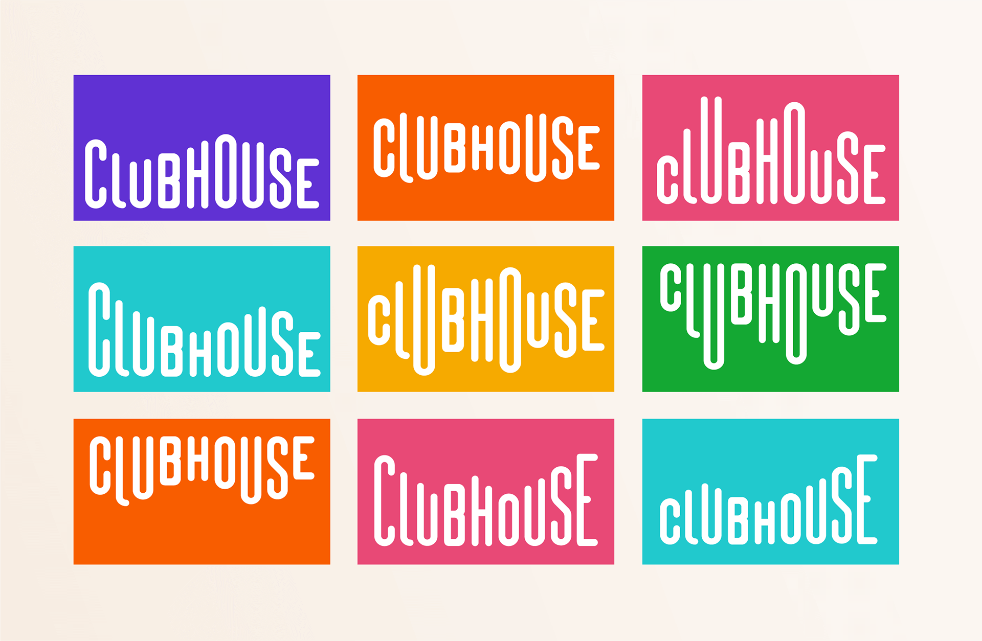
Like Clubhouse that took the sound waves, stylized and scaled them:
The main tasks of identity are to help form a brand (opinion about the company and its products) and work as a tool for its visual communication.
It forms and strengthens the brand much better, adding value to the company. Conceptual identity has a better chance to communicate something to the brand audience since it’s more about emotions and rich language.
Might work just fine if you decide to sell a business or distribute a franchise.
Developing a conceptual identity is the best option for clients who see value in their company’s brand. And plan to scale it.
And of course, it’s better to work on brand identity when there is a brand strategy in place.
After you choose the logo and the identity path, be it conceptual or not, it’s time for putting everything together in a brand guideline or a brandbook. As always, depending on the scale.
Brand Guideline vs. Brandbook
A brand guideline is a set of rules on how to use the logotype or the brand identity—a how-to guide, in other words.
That is to make sure the logo is used how it’s supposed to: with the right colors, positioning, and size.
Here’s for a logo guideline and its content:
- The meaning of the logotype (if any)
- Construction (description of geometry, elaboration of distances between symbols, etc.)
- Structure (sign, text part, descriptor, ®, etc.)
- Description of logo colors
- How to use the logo (dimensions, padding, etc.)
- How not to use the logo (discoloration, deformation, wrong positioning, wrong sizes, etc.)

An identity guideline includes:
- Description of the concept idea
- Grid concept (if any)
- Each layout (grid, if any), dimensions, printing, and production methods, mock-up samples
- Description and visualization of the branding pattern and/or illustrations (if any)
A brandbook is different as it focuses on the marketing part of the brand (mission, vision, buyer person) as well as the brand’s characteristics and strategy.
If the brandbook does not specify the platform nor the strategy, it’s not a brand book — it’s a brand guideline.
A BRANDBOOK ISN’T A GUIDE ON FORMATTING. IT MAY BE, TO SOME EXTENT, SINCE THE BRAND BOOK DESCRIBES THE IDENTITY AND PREVENTS THE BRAND IMAGE FROM BEING BLURRED. BUT BESIDES THIS, IT CONTAINS OTHER INFO LIKE THE PHILOSOPHY AND VALUES, THE TARGET AUDIENCE, PREFERRED COMMUNICATION CHANNELS, AND SO ON.
So here’s what: brand design is not about art and less about the ‘creative part.’
For a nice-looking picture to become a business tool, it takes some — quite a ton, usually — preliminary studies. We study what your target audience likes, what your competitors do, what brand features and product characteristics you have, and much more.
And then, only then, it’s about drawing some nice-looking stuff.
Feel free to contact us, and let us make the best branding for you.