Burfa
project websiteOPPOSITES ATTRACT
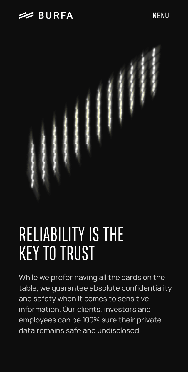
Our task was to convey the spirit, values and enthusiasm of the organization. Burfa is all about duality: they work on a global scale with local dedication, they focus on technology but with a human touch. They are young yet experienced, with a proven track record. They are reliable and serious, without being too conservative.
The name itself is very meaningful. “Burfa” comes from Burkina Faso – “the country of honest people”, so honesty was also an important concept we had to keep in mind.
Somehow we had to visualize all of these elements in the design.
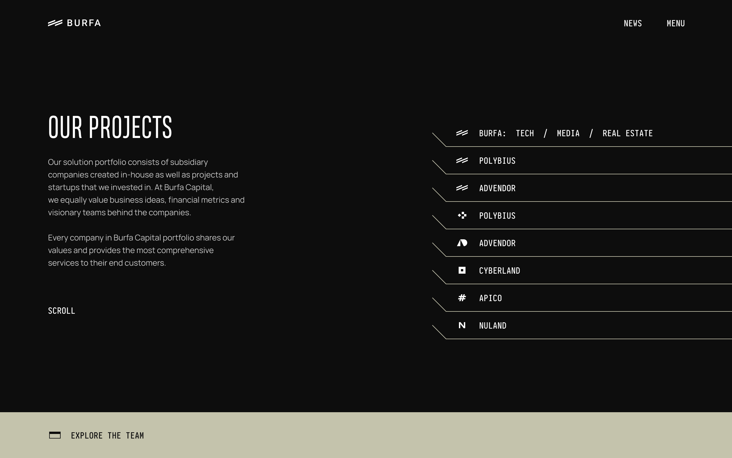
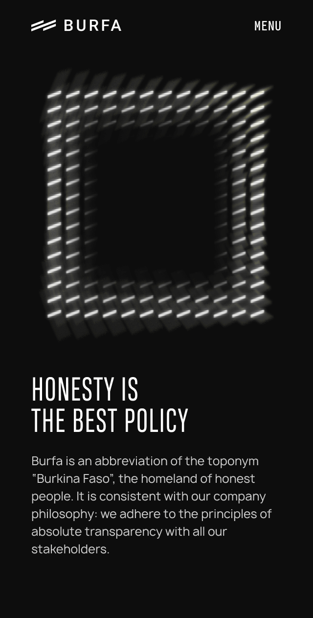
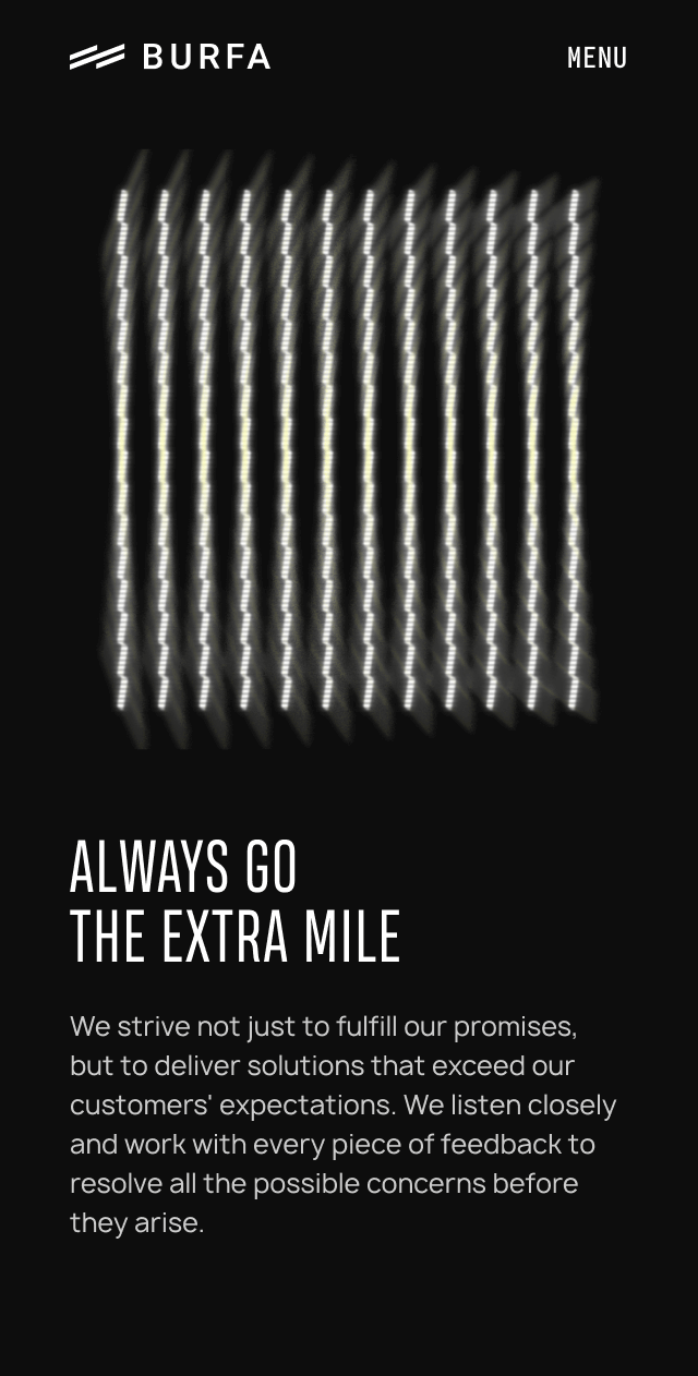
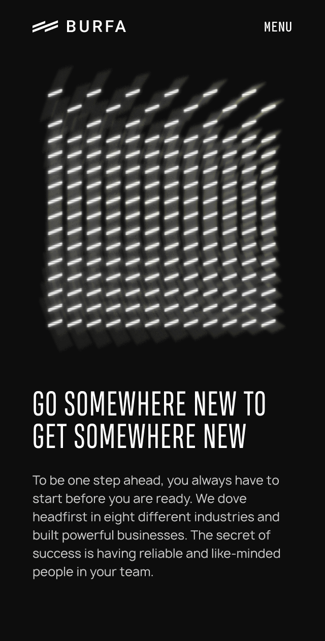
We also had to make a bold visual statement. That’s why we created animated, interactive light objects made up of the Burfa logo.
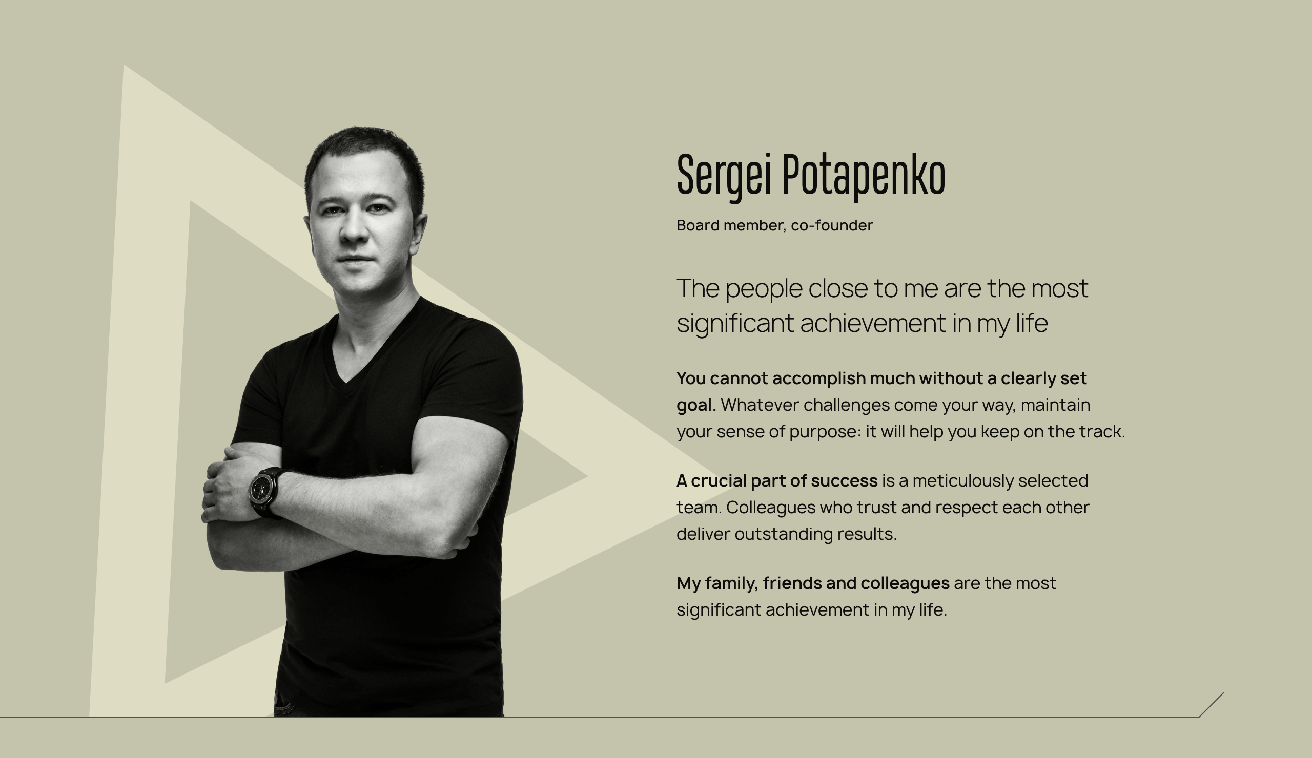
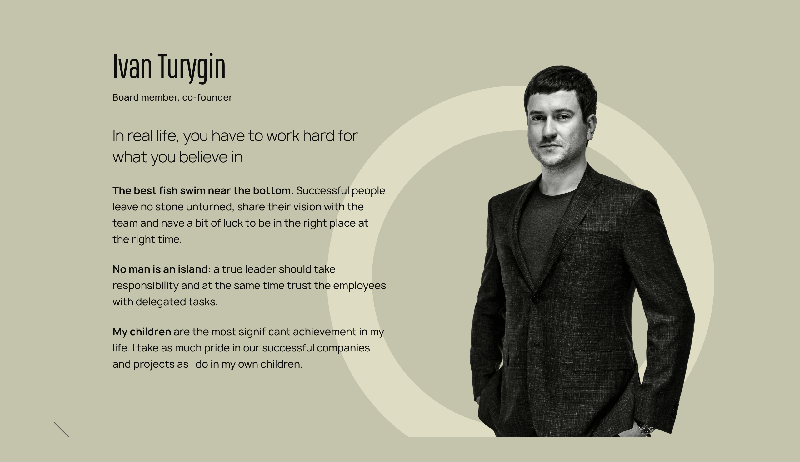
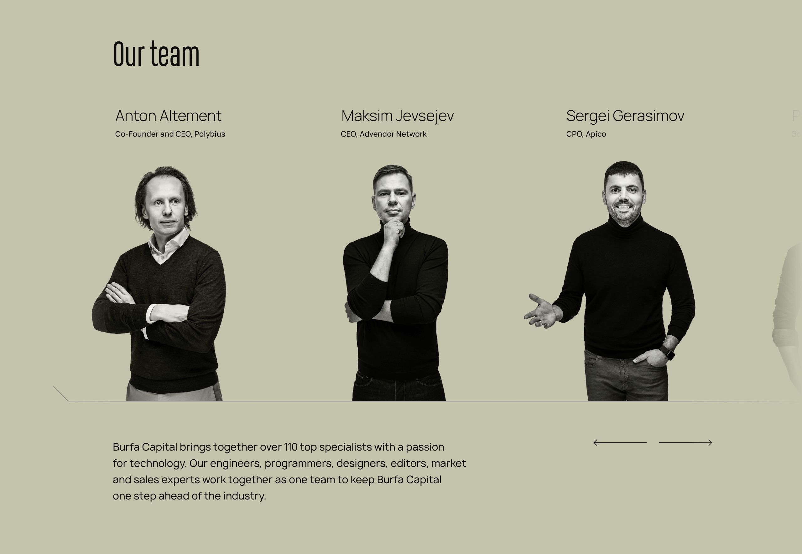
To make the website more personal, we needed portraits of the team. But we didn’t just use any photographer. We took one of the best Ukrainian photographers – a guy that takes pictures of presidents and pop stars. Because that’s how we roll.
We created a visual concept and technical specifications so that all the photos would be in the same style. Then we went all the way to Estonia and had a big shebang of a photoshoot, which became the basis for the team section.
“I was impressed by such innovative ways of thought in the zgraya team. They could find a fresh point of view on trivial issues and offer uncommon solutions.”
Project team
Art Direction: Michael Babenko, Yulia Snitko
Lead Designer: Sergey Tomkovich
Designer: Alex Kuzminskyi
Head of Development: Alexey Kalyuzhnyi
PM: Nikita Derevianchenko, Masha Ozerova
Copy: Valerie Karahan